THINGS THAT CONNECT.
THINGS THAT CONNECT.
THINGS THAT
CONNECT.
THINGS
THAT CONNECT.
We've all grown a little more conscientious about how we approach design since the heady of Flash, but one important lesson i've taken from those times is the value of forming an emotional connection with the people interacting with your interface.
CREATING ENGAGING EXPERIENCES.
Experiences can be small or large moments. They can delightful, purposeful, functional, reliable or even whimsical. How companies and brands speak to their audience is singular to them, and very often a one size fits all approach to design is limiting the expression they can have.
I believe there's always a balance in things. It's all about context. We often fall into absolutes in our industry, which can mean we end up designing the same thing over and over again. There are times for familiarity and standardisation, but occasionally having that chance to really lose yourself in a unique and engaging experience is something that can still make a lasting impression too.

THE FAT DUCK.
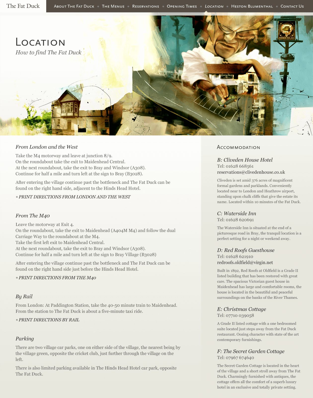
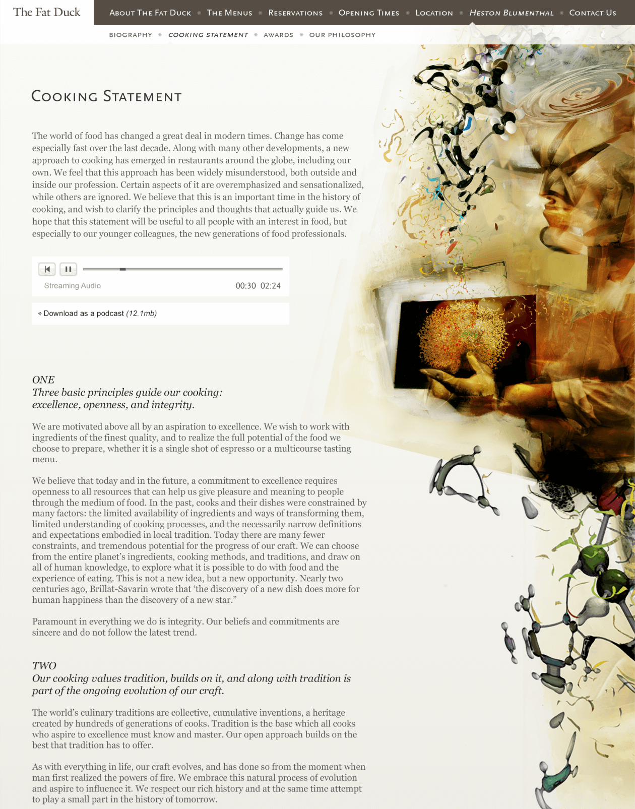
I worked on the previous iteration of Heston Blumethal's website for his world famous restaurant. It was a unique chance to work on a site that really wanted to play with the senses in different ways, the centre-piece of which was an interactive landscape, drawn by my illustration hero Dave McKean.
In preparation for your visit to the restaurant, it attempted to take you through a more sensory guide to how The Fat Duck works, both philosophically and practically with a mixture of sound, animation, illustration and small interactive set pieces.
You can read more about this project here.


THE NATURAL HISTORY MUSEUM.
Similarly, the Natural History Museum wanted to create a more immersive space online to promote the unveiling of their first brand new exhibit in Hintze Hall for over a century.
They were acutely aware that removing a beloved national icon like Dippy the Dinosaur was always going to attract a lot of scrutiny, and wanted something that could help people learn more about the whale and form some kind of emotional connection with her before they arrived to see her in the flesh (so to speak).
I conceived a site that comprised of three ‘environments’ that speak directly to her story. Each of these environments have a number of hotspots that open out to reveal more information about her.
From her time in the ocean and the challenges she would’ve faced, to being taken and held in the Natural History’s Museum’s permanent collection, to the latest stage of her journey, as a new icon hanging in Hintze Hall.
You can read more about it here, or go see the site here >
GOERTEK/BUBBLE LAB.
Goertek's innovation division, Bubble Lab, on the other hand, wanted to create a small AR experience for their booth at CES 2019, that would be an eye-catching moment when passers-by played with the chocolates and coffee they had on offer. Placing a chocolate anywhere on the table brings up a flavour-related projection that plays around it until it's removed again.
BRINGING BRANDS TO LIFE.
Sometimes it's the smaller moments in a larger experience that help a company sell their personality or purpose. I work on a lot of projects that involve bringing elements of their brand to life, with animation, illustration, language and establishing tone of voice and visual standards for design.
It can be something that helps sell difficult concepts or ideas, or grabs your attention at the right time, or simply an aesthetically pleasing moment that helps people bond with a brand.
ЖУК (ZHUCK).
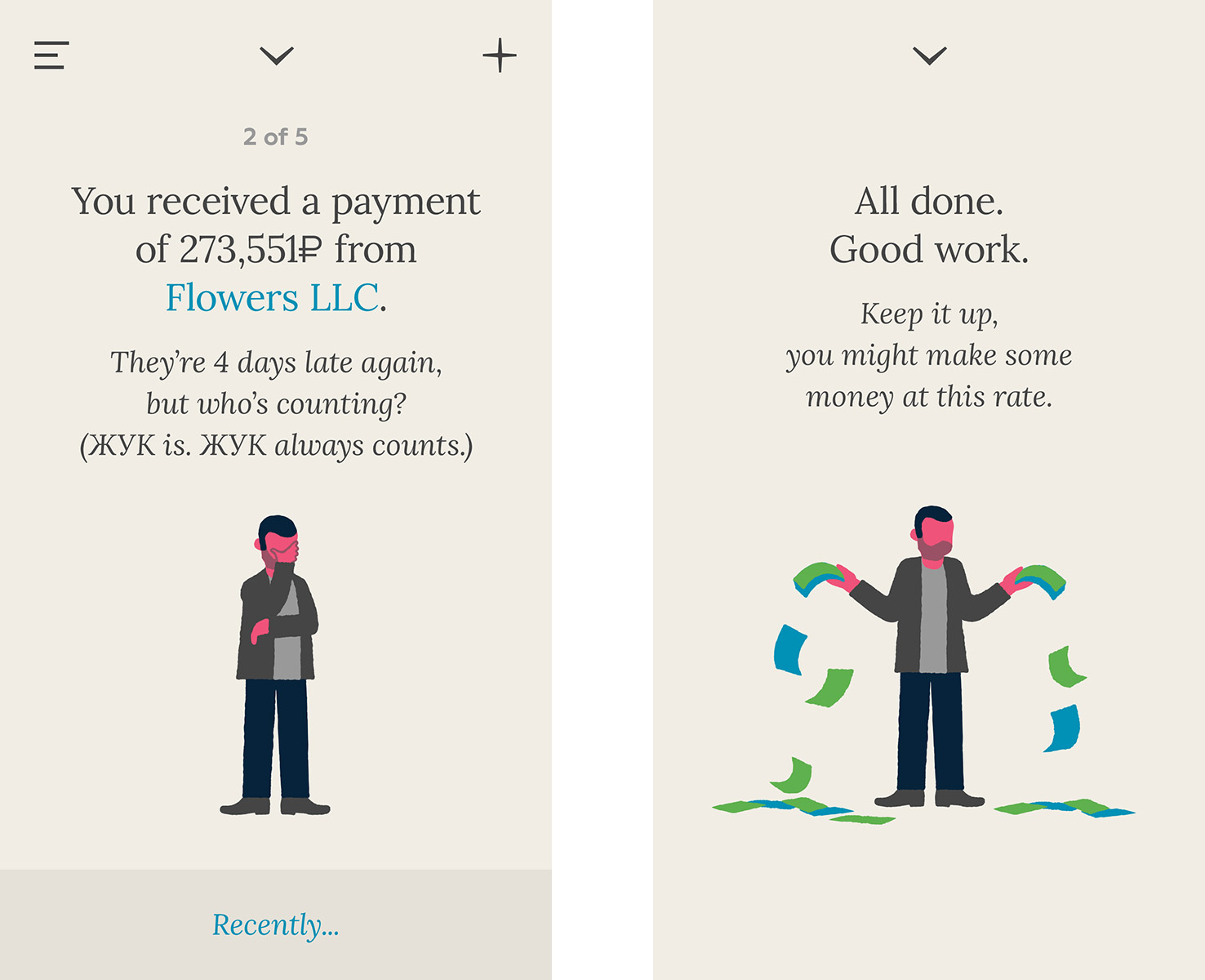
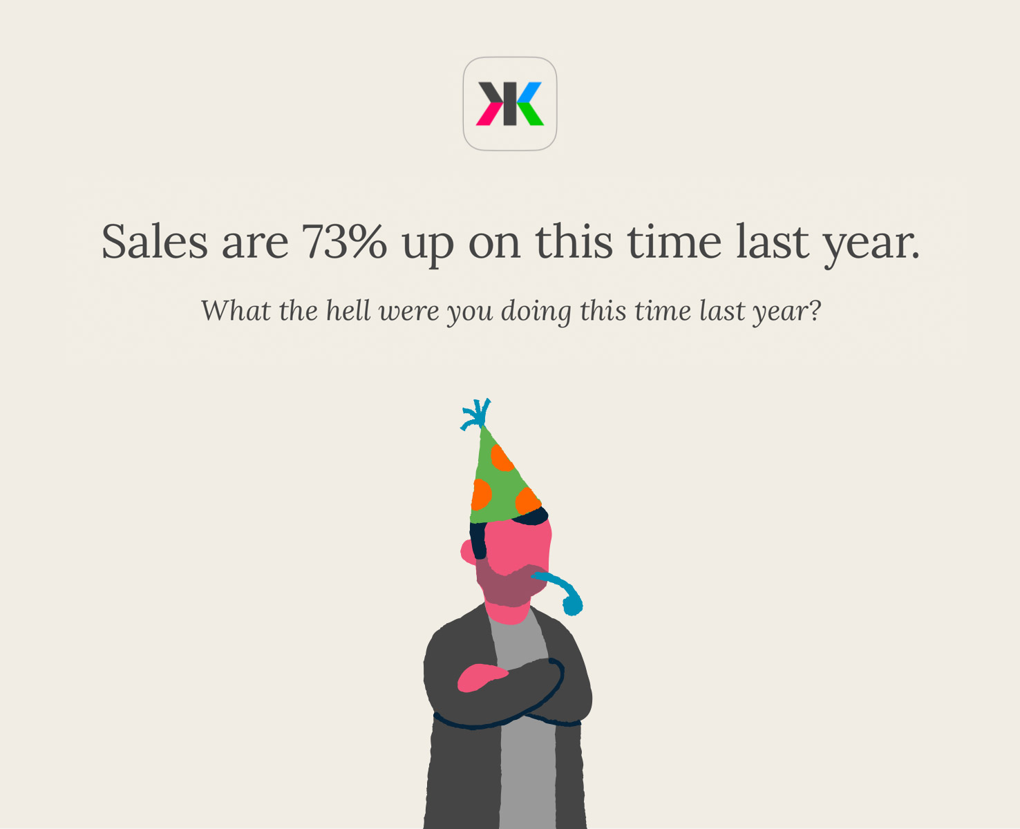
It's often best to help bake that brand into the experience from the get go. Zhuck was a Russian iPhone app designed to give entrepreneurs an idea of the real health of their business, in a country where the government can't be trusted to keep their hands off your money.
Because of this environment, the app was designed to have a personality that would shake the user into action. Zhuck himself is a smart, savvy, sarcastic character who eggs them on to always do better in their daily business. Daily reports keep the user abreast of the most important tasks they have to complete that day, to keep their business as healthy and profitable as possible.

Whilst I didn't create the character for this project, I worked in tandem with the branding agency NB Studio to co-develop the app itself and create the tone of voice and look for its brand. With both sides feeding into each other's work it was a truly collaborative process, building a whole new brand and experience from scratch.
In 2015, Zhuck was not only featured in the Creative Review annual, but also won a prestigious Wooden Pencil at the D&AD awards for best Digital Brand Expression.
GOOGLE.
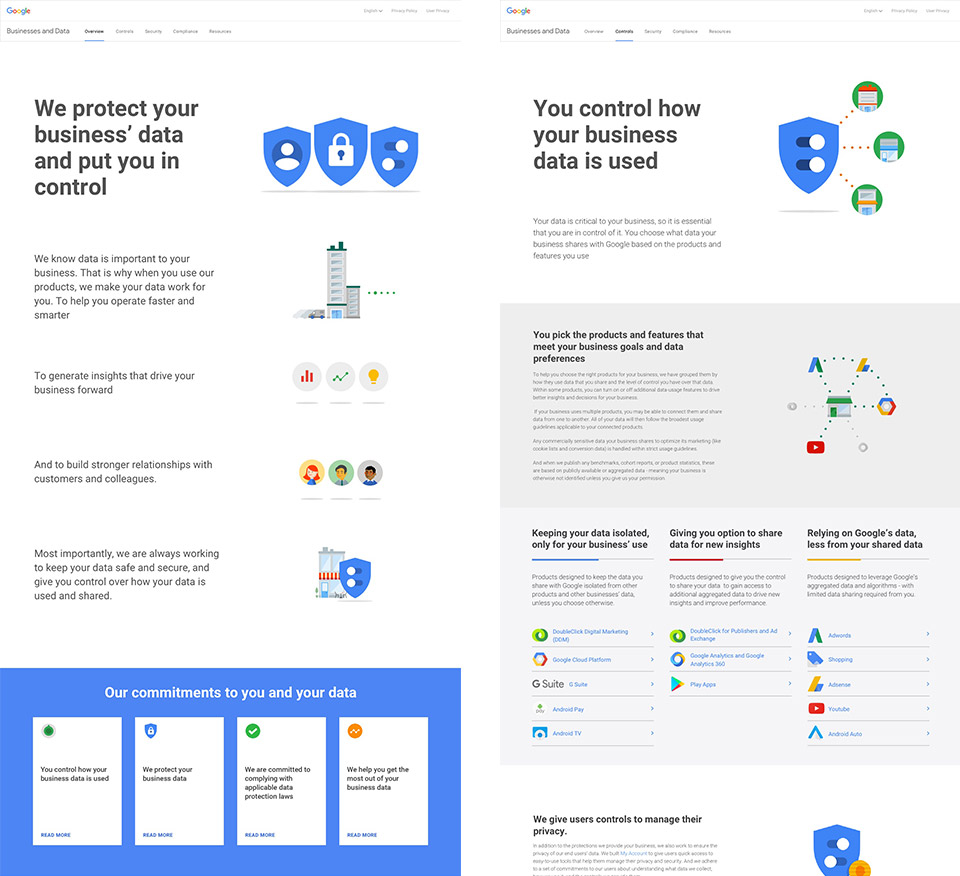
Smaller moments help explain larger stories too. When GDPR came into effect in 2017, companies had to start complying with new laws to be transparent about how they were treating their users personal data. Google had launched a site the previous year for individuals, but I was involved in the design and build for their much more legally complex Business site. Due to the complex legal language being used, it was our job to find some more relatable form of expression for them in illustrations and animations to help break down difficult concepts into more bite-sized chunks. We came up with hundreds of illustrations and animations for the site, most of which didn't get used, but you can read more about it here.
SAMSUNG/DEZEEN.
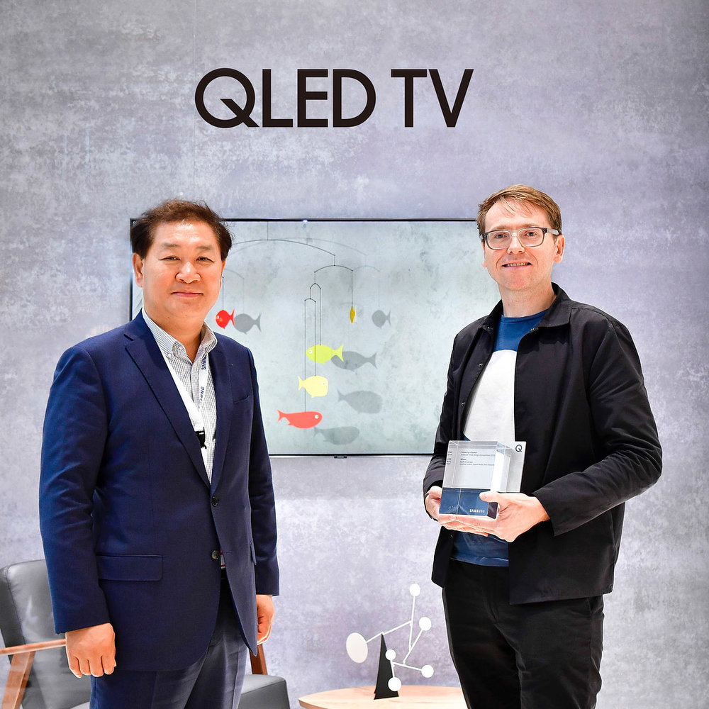
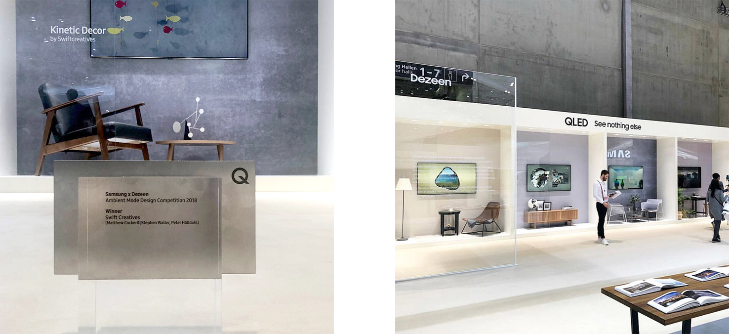
As a follow on from our Mixed Reality work at Swift, we entered and won the Samsung/Dezeen competition to design a piece for Samsung's new QLED TV which featured their new 'Ambient Mode' functionality. Our serene fish respond to not just the lighting of the room, but also the physical presence of anyone standing near it, while fitting seamlessly into any home's aesthetic.
STARTING FROM SCRATCH.
HONEST WORK.
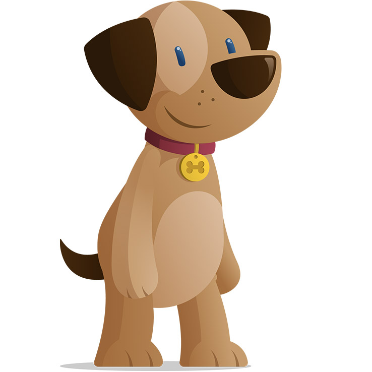
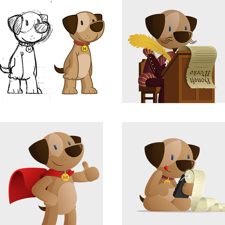
Stevie Buckley's 'Honest Work' has been a fun one to be involved with. His new venture is a job site that values honesty and transparency in the hiring process. He wanted to create a logo and character that felt charming, trustworthy and friendly to match the site's personality. We felt a dog would embody many of these traits, and so Hamish was born.
Hamish's head forms the site's logo, but i've also been commissioned to draw various illustrations of him in different situations around the site which are always fun to do.

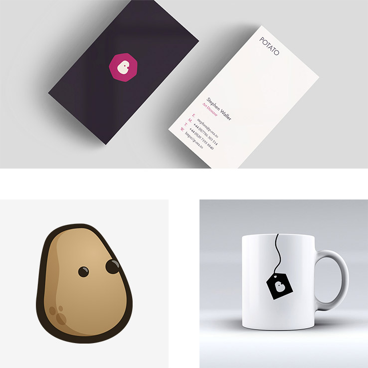
Some jobs are a little larger than others, however. When I joined Potato as Art Director in 2016, their logo was a tired looking cartoon potato, that didn't really speak to the breadth of talent the agency had to offer.
I redesigned it into a new logo mark that could be used in more sober business situations, as well as then also double as a new character for them use in a multitude of ways. The spuddy has been dressed up in a number of guises, for use on internal tools, notices, signage, stickers, t-shirts and beyond. It's an endlessly adaptable blank canvas, that still retains its distinctiveness even when dressed up.

