Client: Google
Agency: Potato
Role: Concept, Creative Direction, Illustration & Animation.
In the run up to GDPR being introduced across Europe, Google, like many other companies, had to start being more transparent about how they were using the data they had accrued from companies that used their services. They had already launched a Privacy website for individuals the year before, so it made sense to launch a sister site, which they called Businesses & Data.
Using the existing Privacy website designed and animated by R/GA and Google’s WSX guidelines as a base, we started the long process of creating a new site with new animations that would try to help explain the immensely complicated (and legally complex) issues surrounding data privacy within the business world. For what now seems like such a basic site, an immense amount of work went on behind the scenes to get it ready on time.
THE SITE ITSELF.
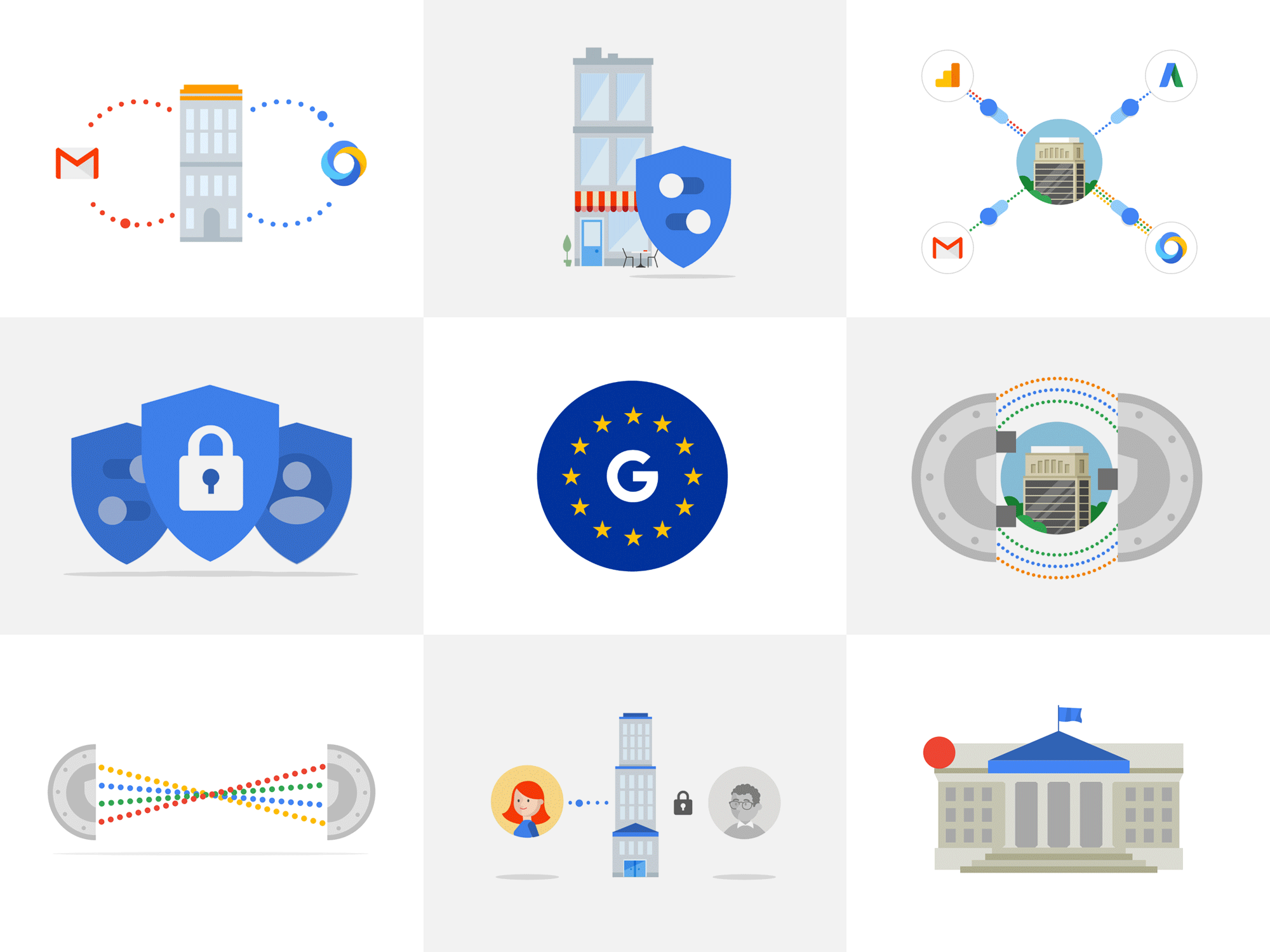
The site itself is theoretically relatively straightforward in design. It was sectioned out into five areas: an introductory home page, Control, Security, Compliance and Resources. The idea was that a set of short paragraphs would be written per section, explaining how each applied to a company’s data, and how Google used and stored it behind the scenes. Each one of these paragraphs would have an accompanying short animation, usually about 3 to 5 seconds long to illustrate the point.
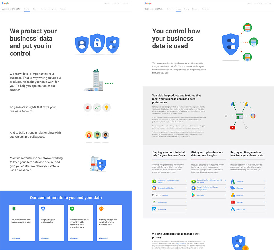
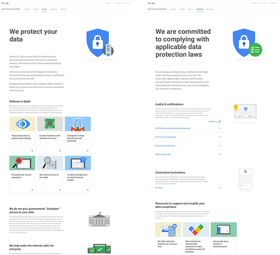
Following existing WSX guidelines, and having the existing Privacy site to inspire us should’ve made the task relatively easy. But even attempting to create the site structure was fraught with problems. Due to the careful technicalities in legal language that obviously result in this sort of project, there were constant disagreements over what, how and where it should be written, which led to wholesale structural changes to the site’s architecture. Modals appeared and disappeared. Whole pages suddenly disappeared over night. For many parts, what had once been an essay requiring accordion text, then changed to a paragraph and then suddenly just a simple line of text, moved somewhere else.
With a solid deadline for launch, we couldn’t just wait for the copy to be signed off, as there were too many stakeholders to make that feasible from a build perspective. Keeping things simple is always hard to get right, but it’s even harder when you’re aiming at a constantly moving target.
THE ILLUSTRATIONS.
With the site’s content changing literally on a daily basis, by far the largest and most time-consuming part of the project were the miniature illustrations and animations. In a rolling Google Doc, content was being written, edited, rewritten, disputed, legally picked over, cut back, reinstated and then often completely removed in real time, which made it immensely difficult to create a solid set of illustrations that could be then moved into animation. What worked as a visual aid for one idea, the next day made no sense when the paragraph had been changed completely.
Because each illustration needed to be animation eventually, I essentially ended up creating short 3 to 4 frame storyboards for every single potential illustration required. I started drawing them by hand but the copy changed so frequently and completely that this fast became impractical.
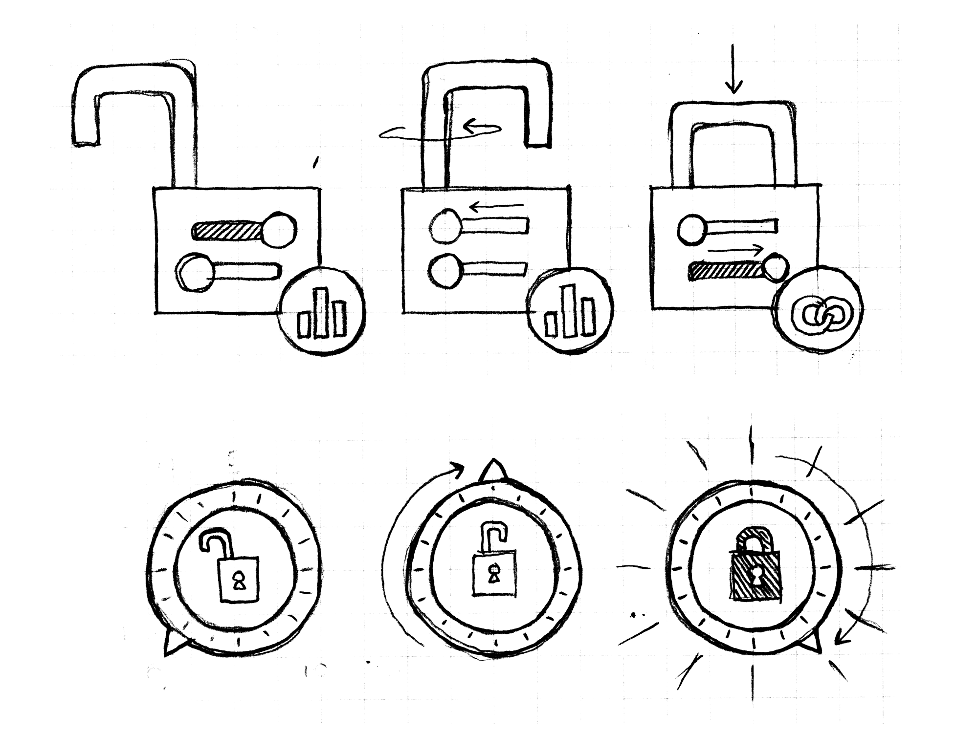
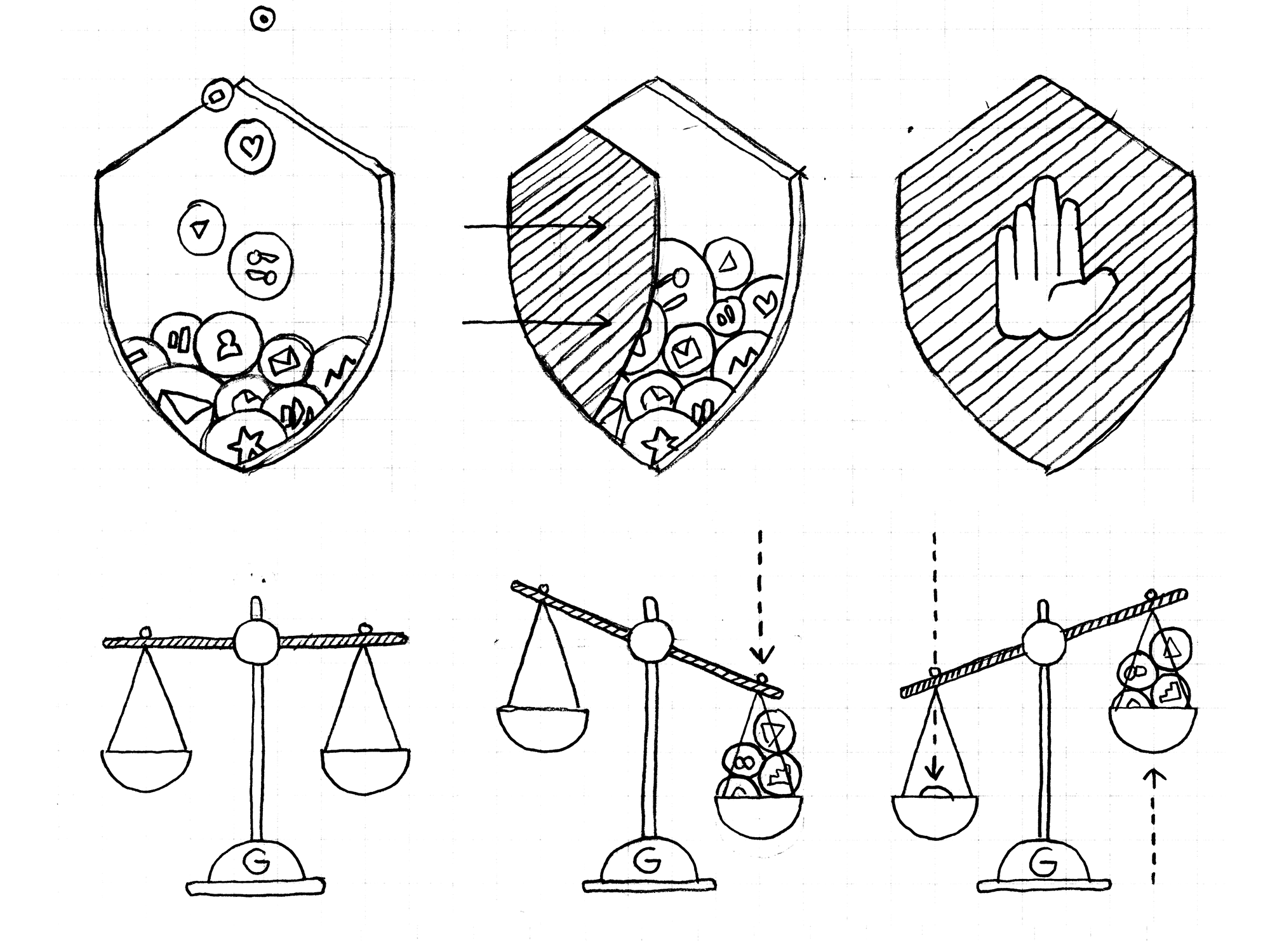
Then the next issue was, what was the correct style for the illustrations? Google’s brand guidelines are always evolving, so finding the correct ‘Google-yness’ took a lot of back and forth with Google’s in-house brand team, Brand Studio. We went through so many variations of how data should be represented; should it be icon based? Should they be dots? Or pulses? The shields were important, but not everything could be a shield. We also were told firmly that Google’s ‘G’ logo could not feature anywhere.
Because business data is a less personal concept, using people seemed irrelevant. Attempting to nail down the style in the end required a trip to San Francisco to spend a week with Brand Studio team locked in a room to figure it out. Should they be literal or metaphorical illustrations? Figurative? Abstract? We went through many permutations to try and find the best approach, ending with a good mixture of original and reconstituted work.
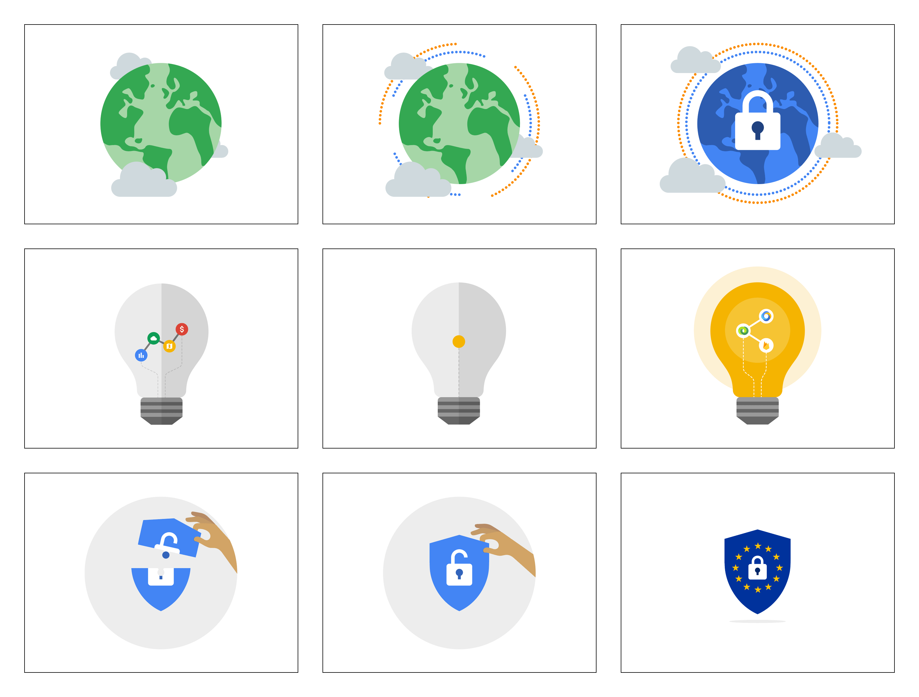
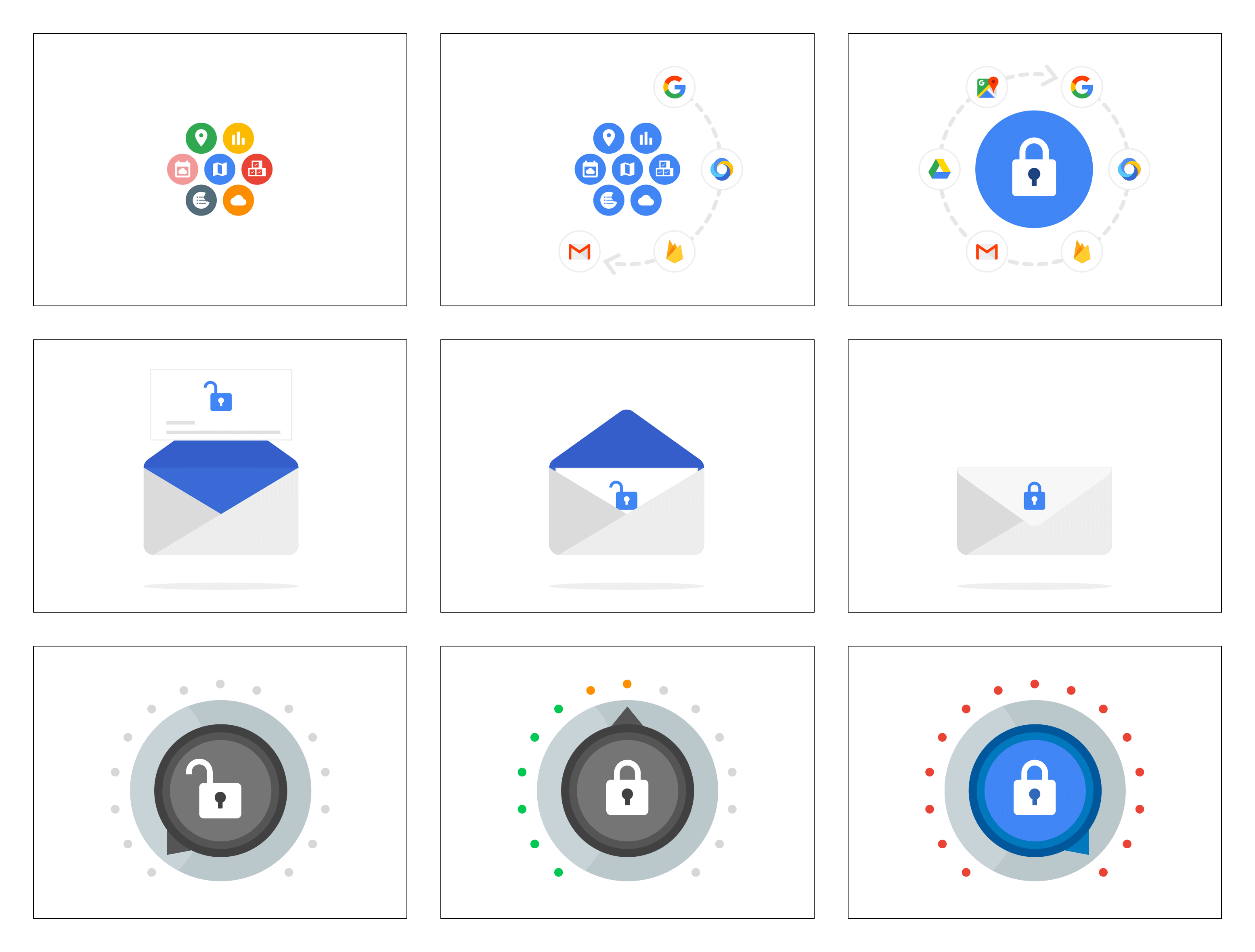
It was a huge undertaking and we produced hundreds of illustrations and storyboards, most of which near the end were removed when the copy was finally locked down. Some of them had even already moved into the animation phase before being cut completely.
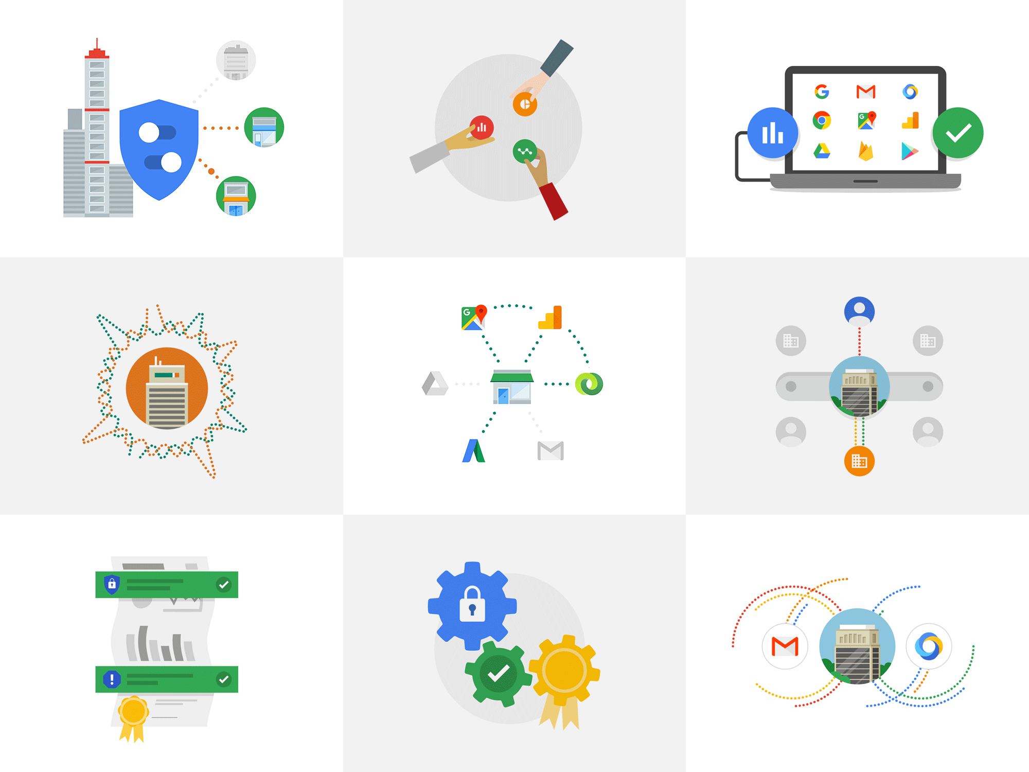
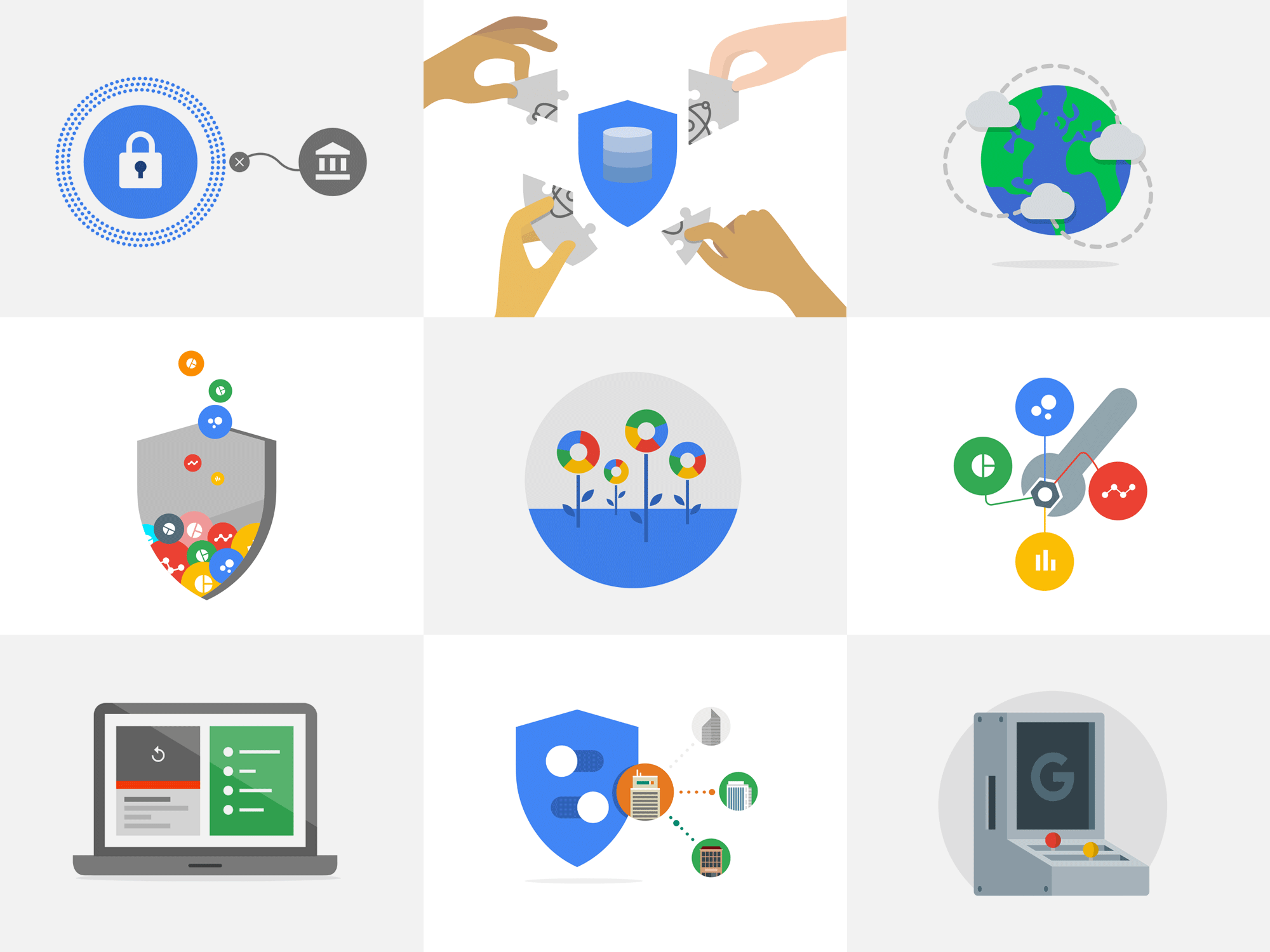
So many unused illustrations.... sooooo maaaaannnyy...
THE ANIMATIONS.
The final hurdle for the design team was moving the approved illustrations into the animation phase. In the original privacy site, these had been created in After Effects, but exported out as JSON files using a plug-in called Bodymovin. This meant they were essentially vector-based SVG animations, rather than movies or animated gifs. This kept the page weight down, loaded faster, and also meant they could be resized on the fly without losing any quality.
Learning Bodymovin’s limitations was a new challenge for me, but I also added Rubberhose into the mix too, to make some of the movements feel more fluid and realistic.
Some of the animations created for the website.