THINGS THAT WORK.
THINGS THAT WORK.
THINGS THAT
WORK.
THINGS
THAT WORK.
Coming up with ideas is fun, but it's all for nothing if the things you're eventually making don't actually work properly. I love making products and services that people can actually use on a day to day basis, and work as smoothly and enjoyably as possible.
MOBILE APPS.
A lot of the real-world projects I get involved in are still mobile-based products and services, both native and browser based, depending on the client's needs.
Some of these projects are fast turnarounds to get an app to market quickly, and some are lengthier engagements to help develop and build out the product's ecosystem, so it becomes a much more robust offering. Irrespective of time scales, though, I always bring the same level of due diligence, craft and a rigorous eye for detail to every project i'm involved with.
These often involve implementing existing design guidelines for the likes of Google, and or sometimes it's even developing new ones, like for Pitch@Palace below.

PITCH@PALACE
In what is probably the perfect example of a quick turnaround, at Potato we concepted, designed and built an app for the now disgraced Duke of York's 'Pitch@Palace' initiative in the space of just one month.
Pitch@Palace was essentially Prince Andrew's large scale version of Dragon's Den, allowing aspiring entrepreneurs aroud the world to pitch their ideas to a room full of investors to help kickstart their businesses and products.
Going from research and discovery into design and build immediately, we had to create an app that would allow everyone attending his events to see and message each other, organise ad hoc meetings, and vote on who they thought would be the best concepts of the night to invest in.
ЖУК (ZHUCK) APP.
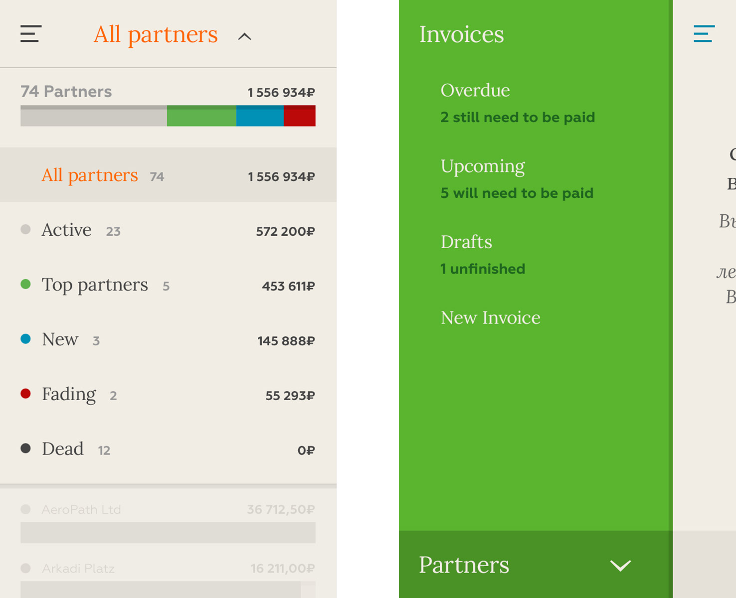
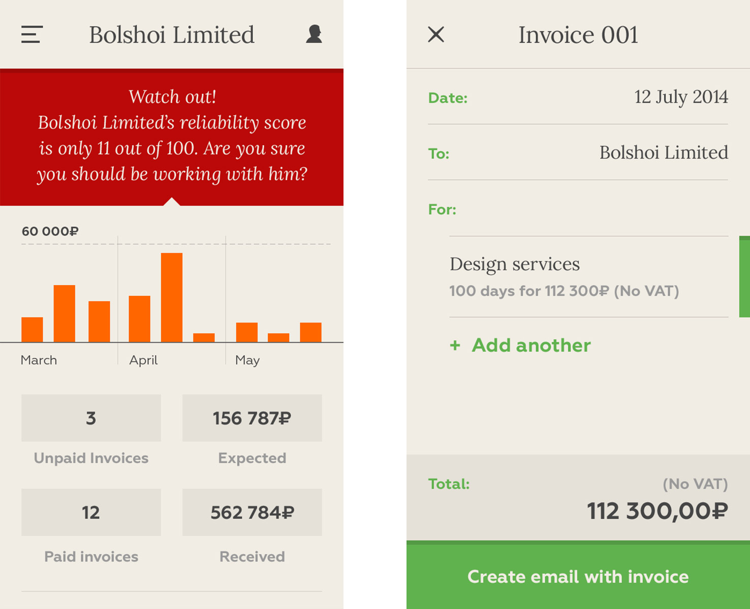
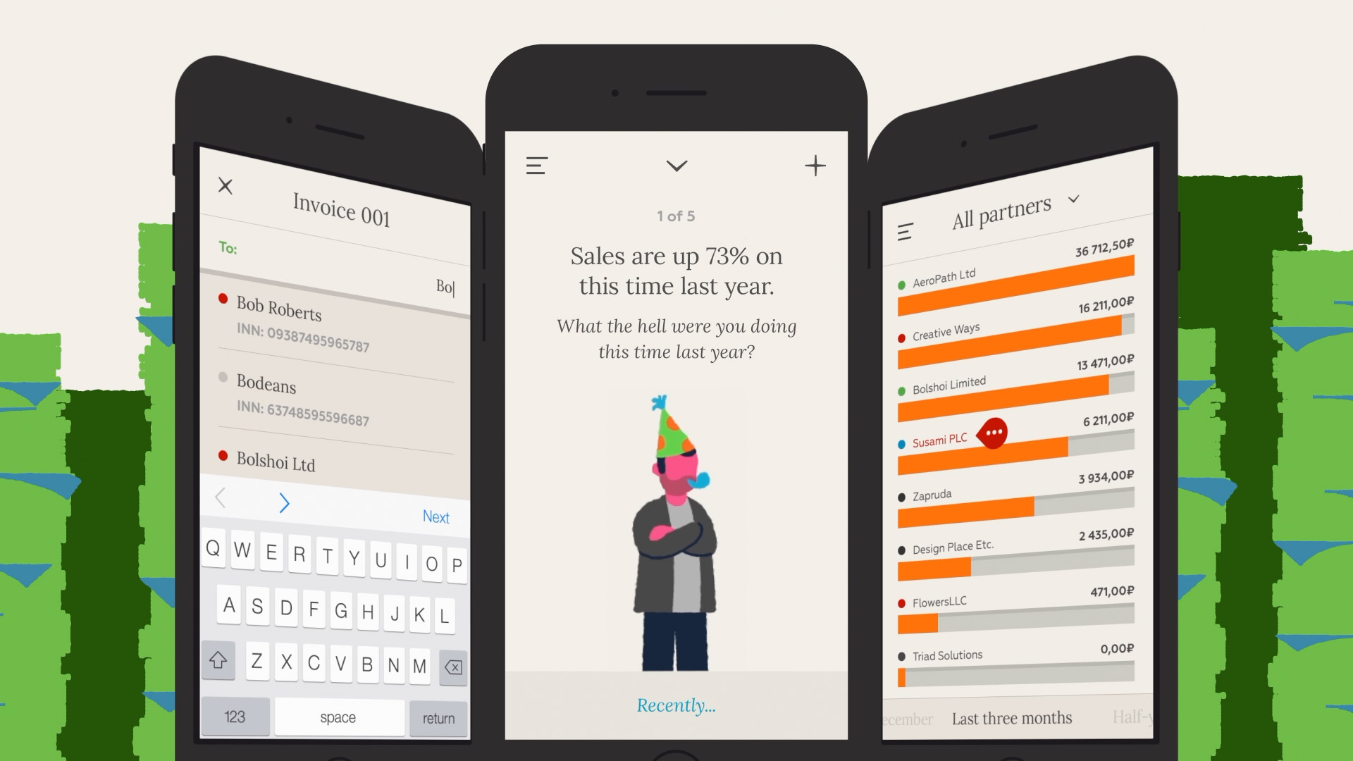
The flipside of the coin to creating the branding of ZHUCK (head over here to read up on that), was actually creating the app itself. It was essentially a service that allowed Russian entrepreneurs to track the growth of their company away from the ever watchful gaze of the Russian government, who at any point could swoop in and destroy a business, either legally or financially.
We developed an app that allowed entrepreneurs to track their partners' reliability, send and receive invoices and monitor their actual profit and loss both on and off the books to keep the real health of their business a secret from their own government.
Whilst the personality of the app was playful, we wanted to make sure the usability of it was immensely clean, functional and intuitive. The internal team at Bank24 continuously tested our work and built out the eventual app that launched in 2015.


KODAK MOMENTS.
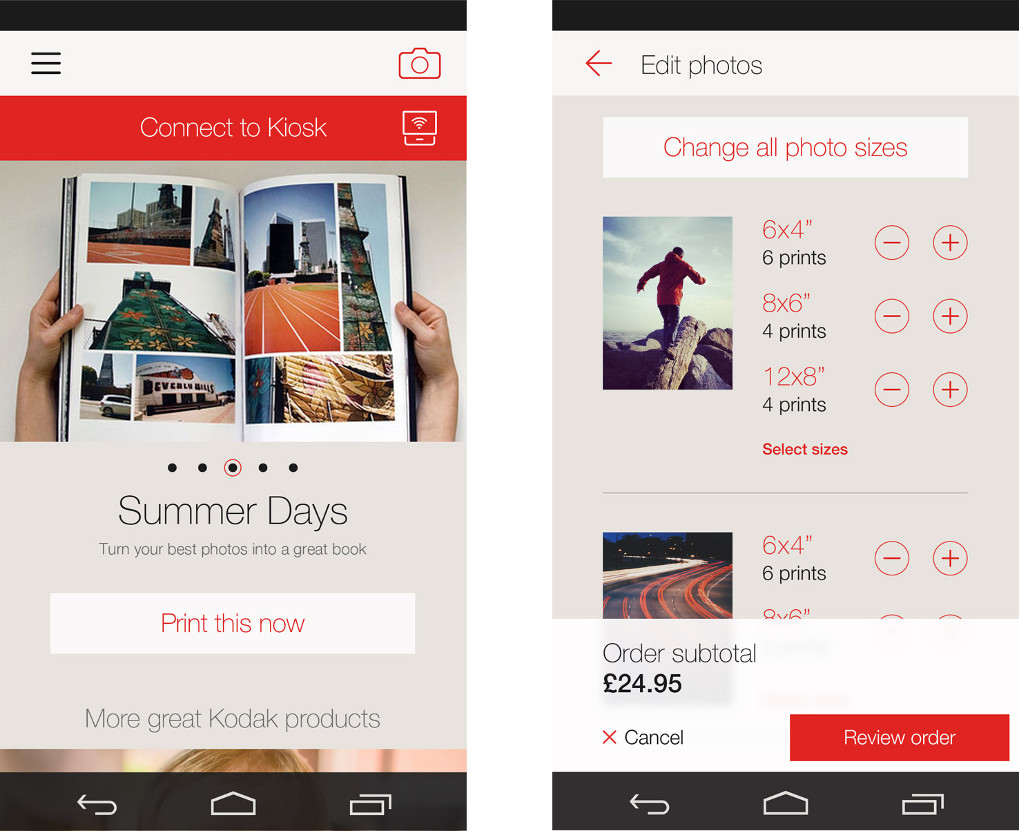
At Else, we worked with Kodak Alaris to completely rebuild their Kodak Moments app, a service they'd had for a while on Android and iPhone but whose functionality was woefully lacking. Moments allowed people to connect to machines in stores to print their photos, or order prints and photobooks online, but people were frustrated with the app's poor usability, so we started completely from scratch, building the app from the ground up once again.
The app came in two parts. The first was a built in camera app, that came with a suite of lens presets designed by Kodak themselves to help customers take their photos just right. We wanted to strip away a lot of the bulky chrome that came with camera apps at the time, and allow the photo to fill the screen and keep the UI as unobtrusive as possible.
The second part of the app was the larger photo manipulation and ecommerce offering.
When the interface was 'light', that was when people knew they were in a browsing mode, choosing what sort of products they wanted to buy, and when the interface switched to 'dark', that was when the customers were then in an creation mode, editing their photos and creating their products.
The app allowed them to make or order prints, cards, collages and whole photobooks, which made for tricky interaction problems to solve on such small screens.
WEB & DESKTOP APPS.
There's still a lot of call for desktop based applications these days, though. I've been involved in a number of them, particularly in the internal work I did for Google whilst working at Potato. Many of these are still required to be responsive in nature, but some are designed specifically for large screens, which allow for more complex feature sets and interactions.
SPARKS
Although it obviously looks a little long in the tooth aesthetically these days (wood panneling!), The Cisco Learning Environment was nevertheless a very big project for me. It was an immensely complex and involved system that attempted to essentially create a school online.


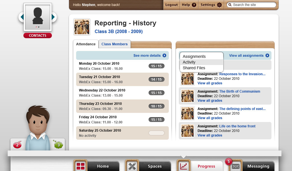

Designed for communities that couldn't physically get to a single location together, the CLE made use of Cisco's own technology to create a virtual classroom that students could log onto, watch live video lessons, message one another, collaboratively work together on projects and submit homework which could be marked online by their teacher.
The whole project ran for a year and a half, and as well as working with UK education experts, we spent many weeks flying over and working with the Cisco team in Bangalore to develop and test the platform before its soft launch across three different schools.
It eventually launched in India and Australia for an extended trial period, running on the open source education platform, Moodle, before it was closed down around 2013.
S7 AIRLINES BOOKING PORTAL.
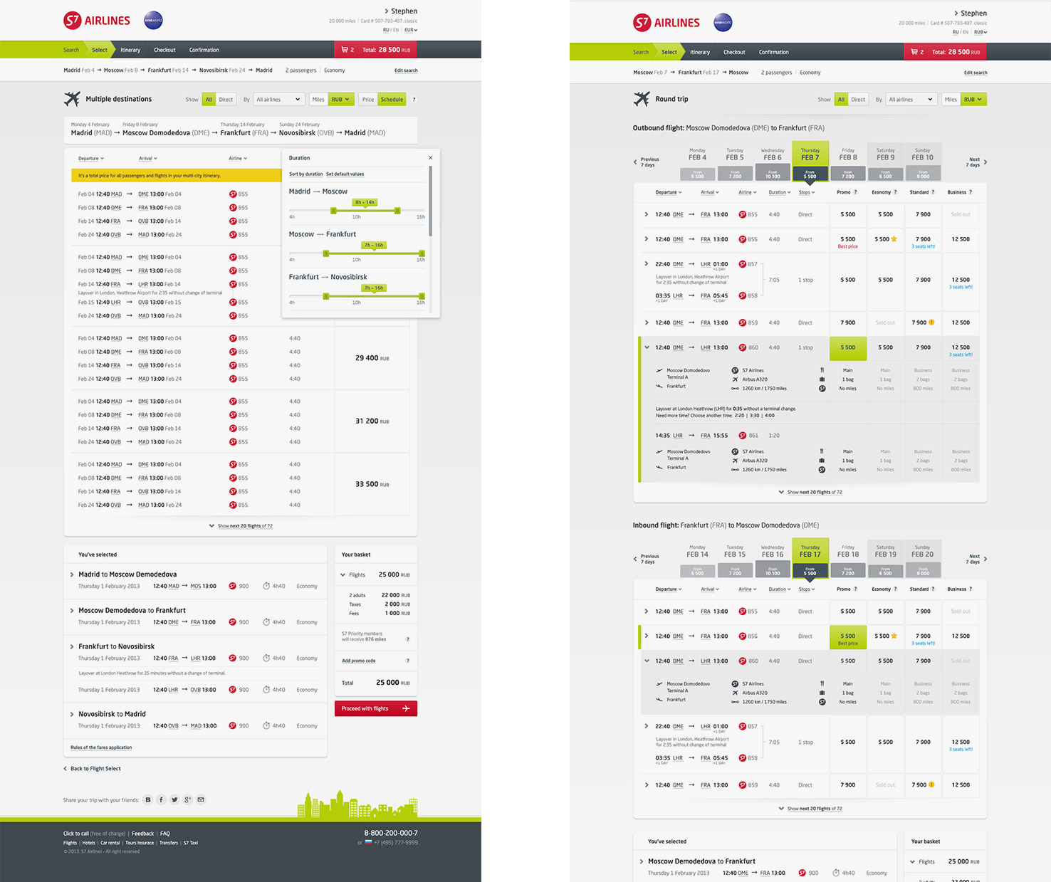
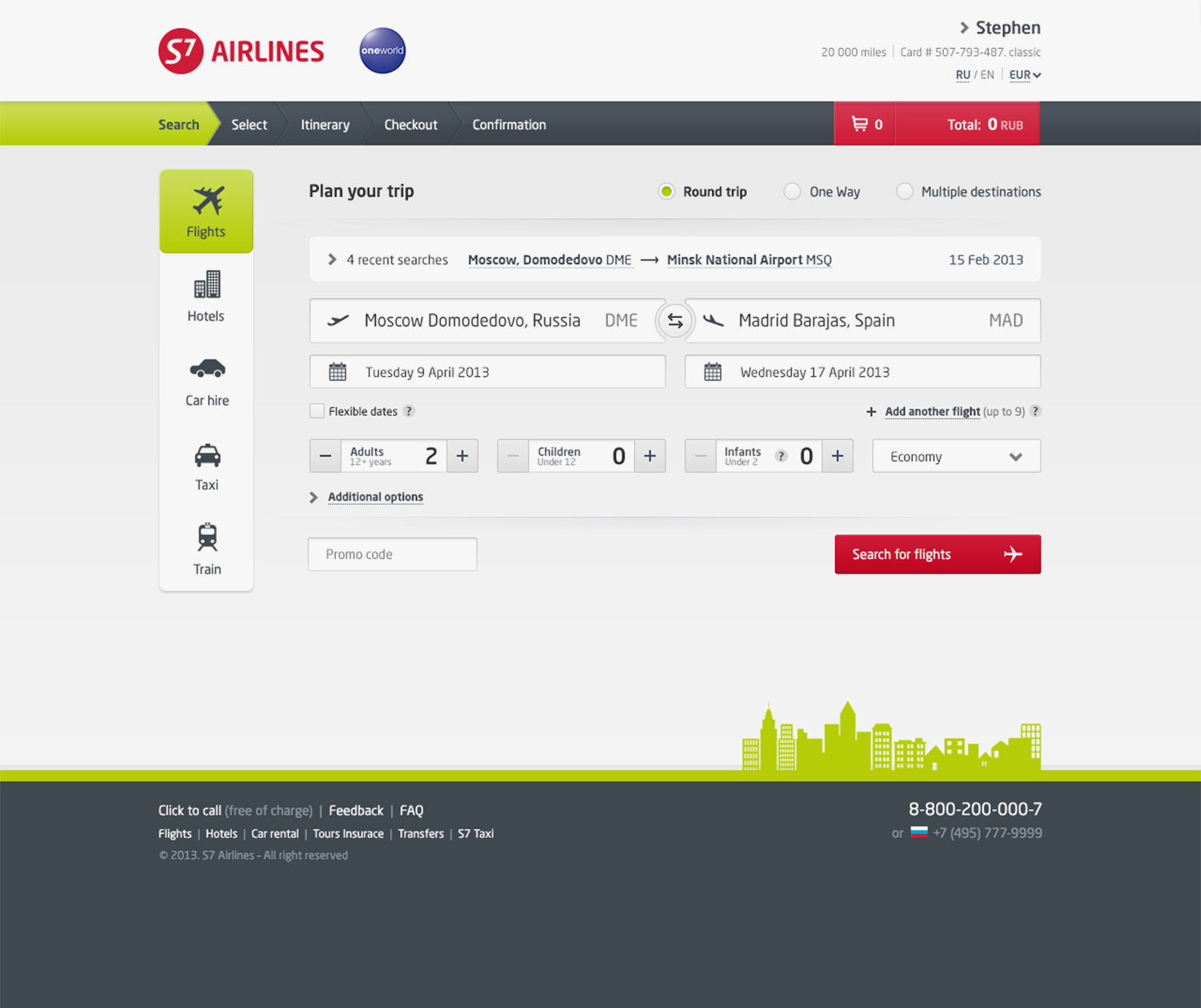
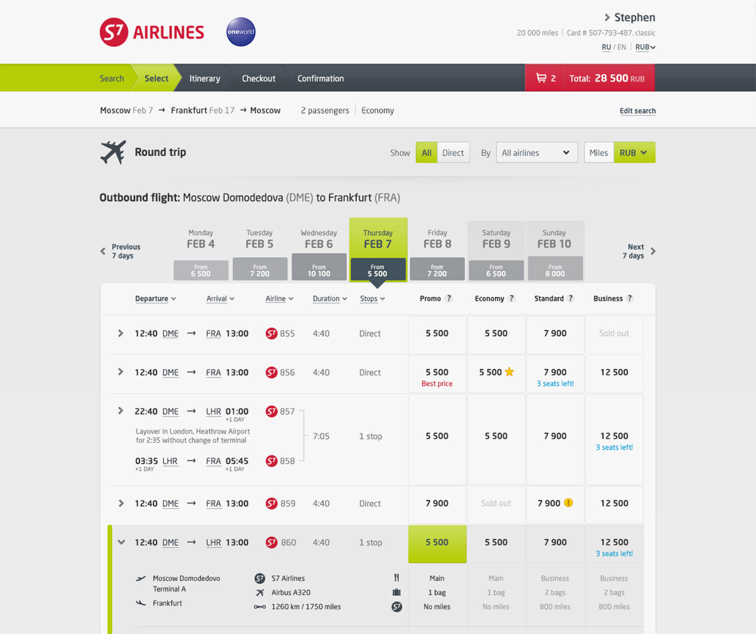
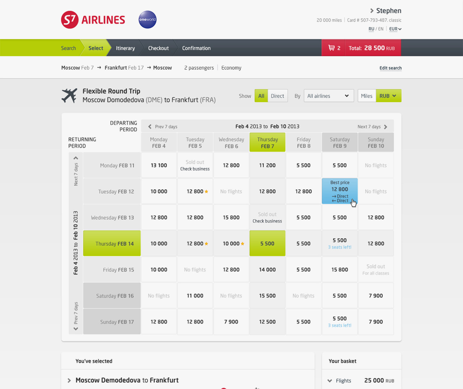
In case of S7 Airlines, we needed to make their IBE work far more efficiently. Their website's usability was seriously lacking, and as a result, their drop out rate was exceptionally high. We took on the mammoth task of completely redesigning their booking flow for flights, hotels and hire cars to help bring their conversion rate way up. I mostly worked on their flights offer, reworking their flight booking and trip itinerary for the desktop site.
We simplified the visual and interaction language of the site, to try and make it as straightforward and easy to use as possible. The project was an immense success, with S7 seeing their ecommerce conversion increase by 40% and their overall online revenue increase by a staggering 76%.

Winner of a DBA Award for Travel & Leisure in 2016.
Winner of a DBA Award for Travel & Leisure in 2016.
OTHER INTERFACES.
I also get to play around with other types of interfaces too. From touch screens in trade shows, to self-service machines in shopping centres, getting to play in a fixed size once again can also be immensely satisfying. Knowing where every detail can be crafted and fixed allows for a more considered space than a responsive interface can often allow for.

NISSEI ICE CREAM.
Working in tandem with our own industrial designers at Swift, I recently worked with Goertek and Japan's Nissei Ice Cream manufacturer to create a self-service ice cream machine that will be placed in various locations around China. The machine automatically dispenses two different types of ice cream into a cone right in front of you, and it was my job to create an enticing and delicious looking interface to drawn people in.
We created a number of interactive prototypes to show how the interface could work, and then completely designed the system for them to take internally and build. I hope I get to see it in action some day.
MEG SCAN.
Lastly, an extremely interesting project for me has been working with Jason Mesut to develop the user interface for York Instrument's Magnetoencephalography scanner. A piece of hardware so sophisticated, it can identify precise locations of electrical activity in the brain. Unfortunately the software used to run it was stuck firmly in the past, so Jason and I helped create a far more efficient experience, from the initial patient pre-processing through to the eventual data analysis. Because the system helps identify everything from epilepsy to brain cancer, the software had to be precise, easy to use and help technicians make sense of the data they were seeing as quickly as possible.
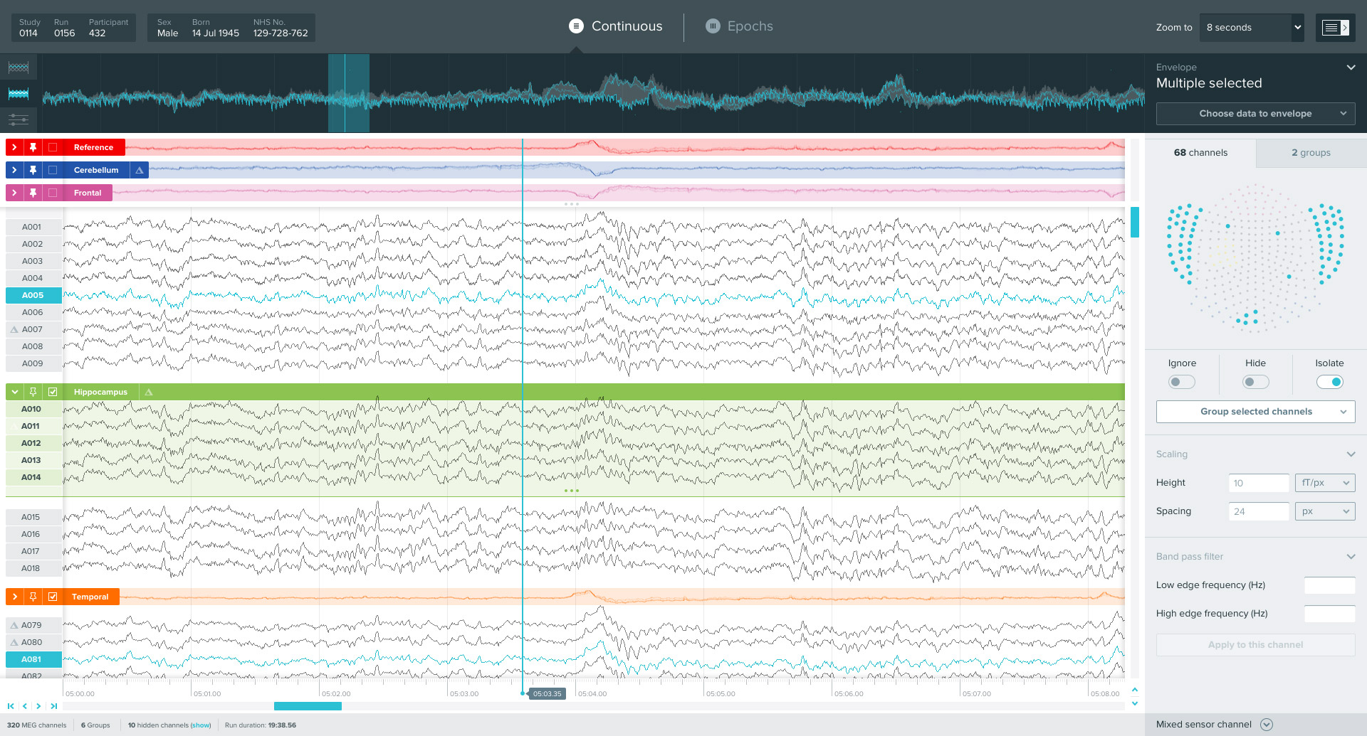

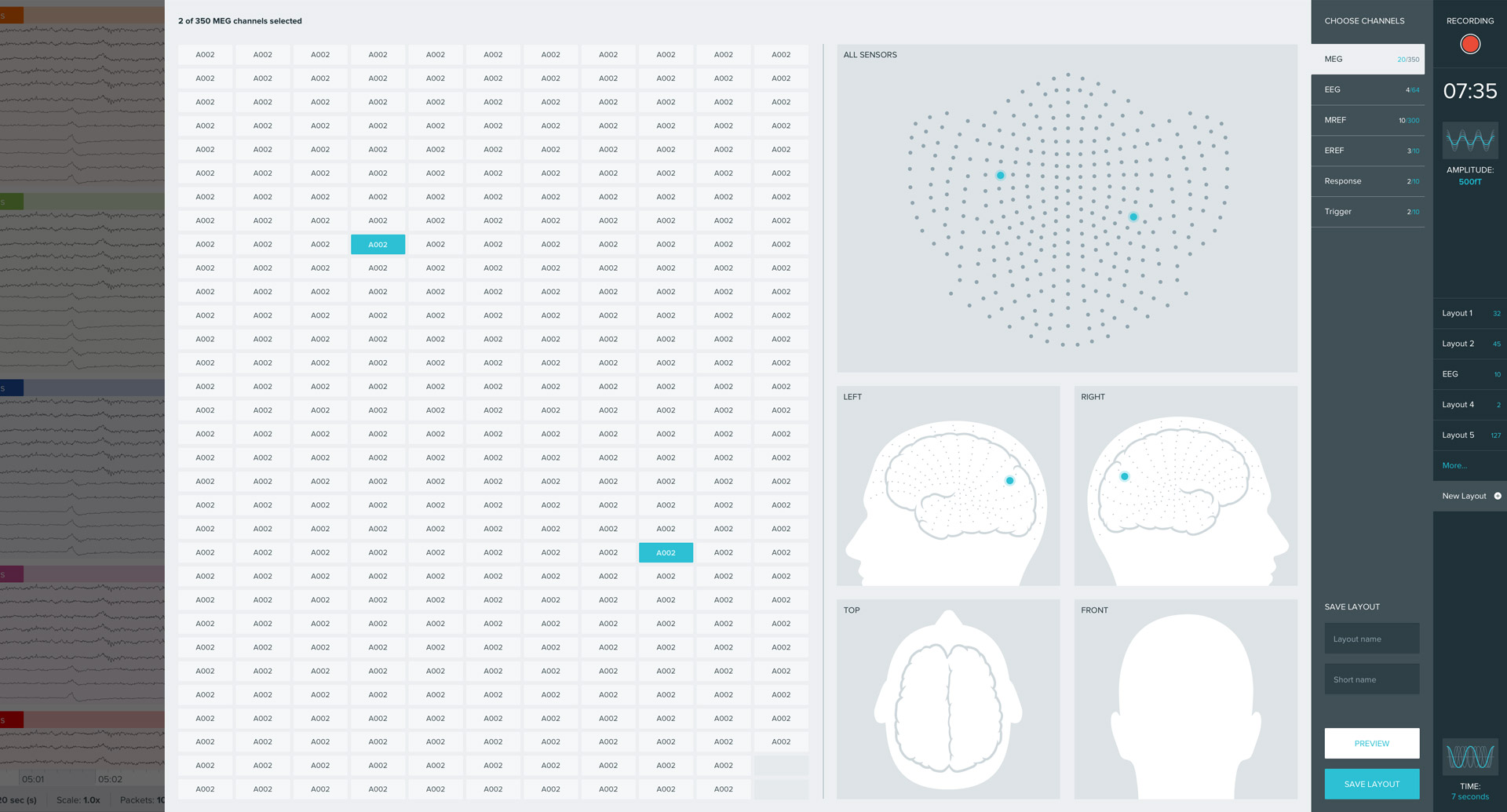
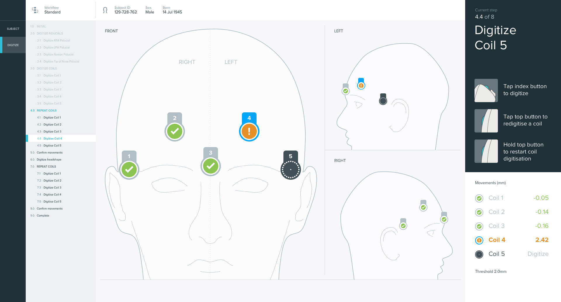
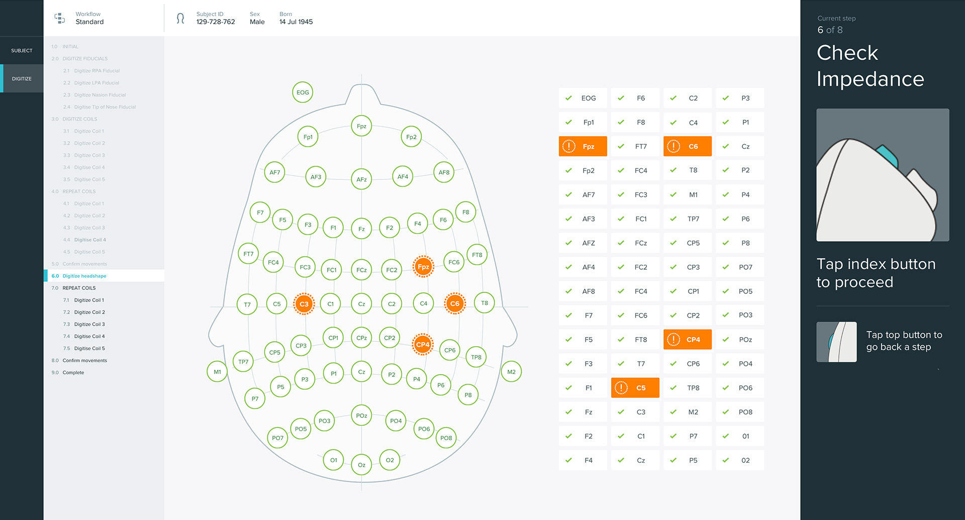

A large portion of my role was trying to wrestle vast amounts of very complex data and functionality into confined spaces, and help make it clear and accessible to anyone coming to the system for the first time. Thankfully the screens the interfaces run on are mercifully large, to allow for clearer data interrogation.
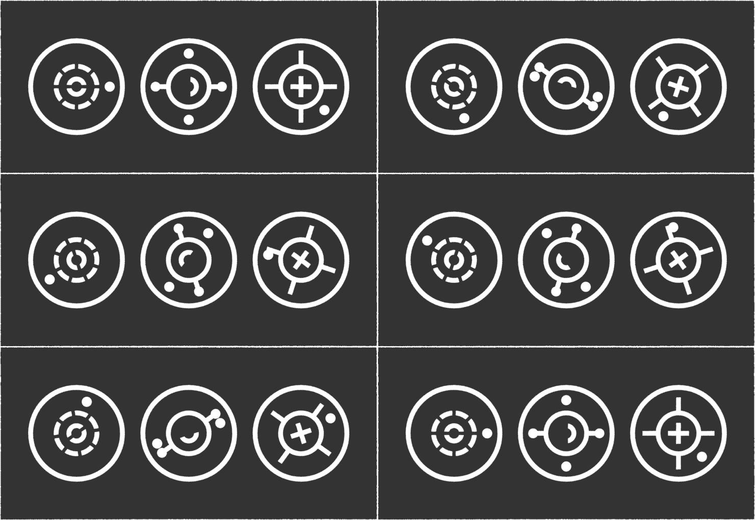
It was also my role to help flesh out the visual language of the application. I developed the iconography and identity of each of the four areas of the application, to be consistent with the brand creation they had previously undertaken.
In the end, the work we completed helped York Instruments secure funding to bring this technology to a wider market, with a beautiful and useable software suite to support it.


