YOTO
Position: Lead Product Experience Designer
Website: Yoto
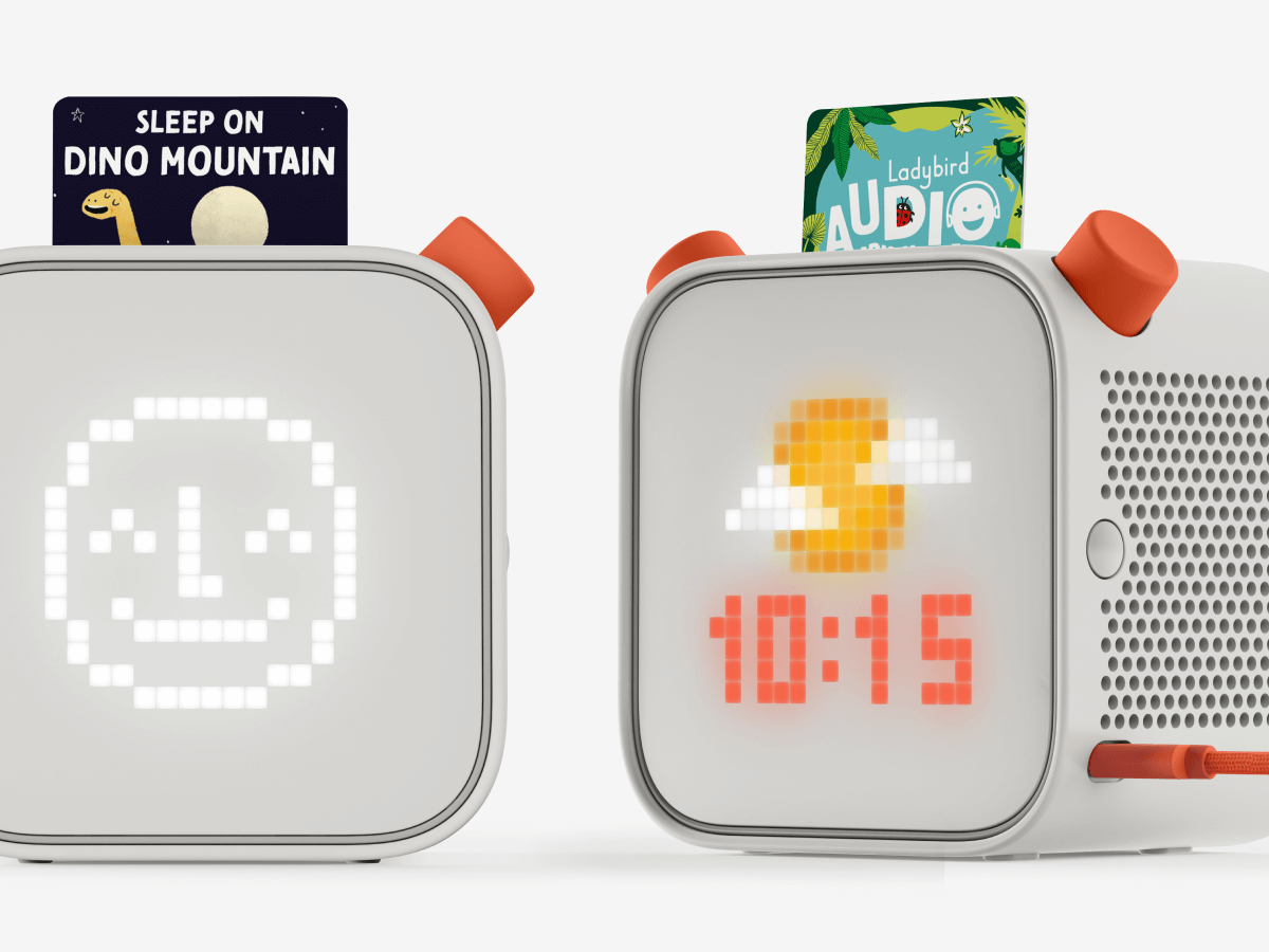
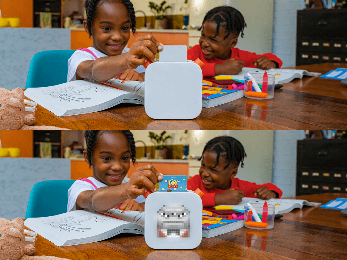
Yoto make screen-free audio players for kids to encourage independent play and foster imagination. Children can listen to all manner of purchased and free audio, from stories to music and podcasts by slotting little plastic cards into the top of their Yoto Player.
I was brought in to sort out the digital part of Yoto's offering, predominantly redesigning their app and website, while working with their developers to establish a design system that could be used by many different parts of the business.
But i've also been involved in creating marketing collateral, Amazon templates, illustrations, photography and other sundry artworking bits and pieces to support their creative team.
THE WEBSITE
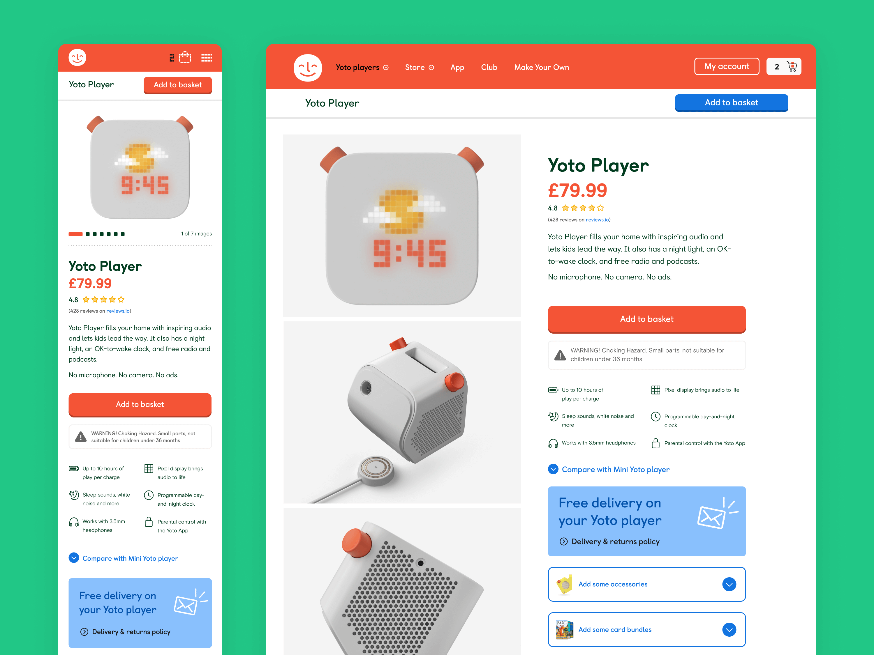
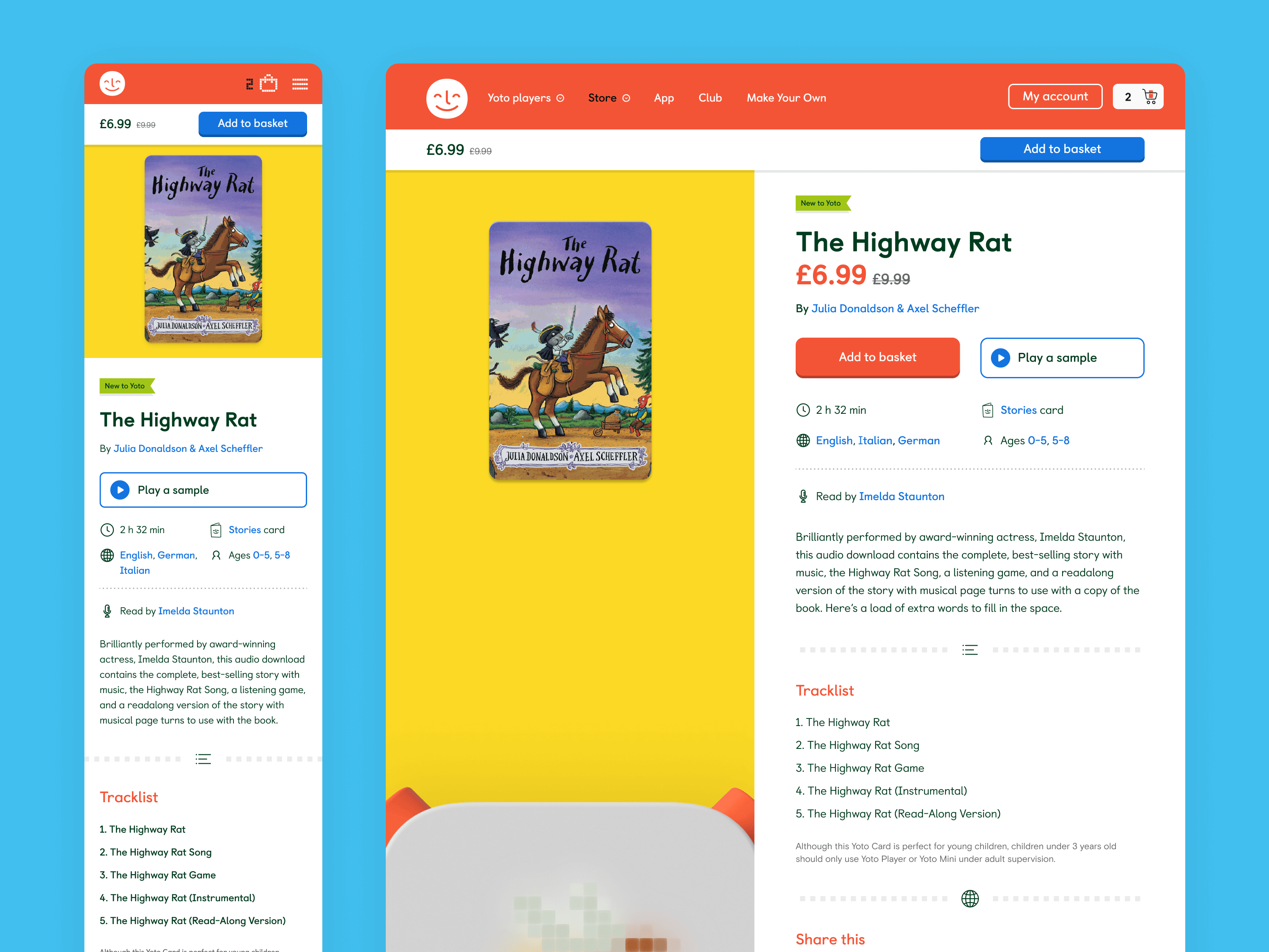
Previously hosted solely on Shopify, the Yoto site was becoming desperately slow and painful to maintain. So the development team decided to move the site to a headless build. Using the existing fonts and colours Yoto had in their brand, we very quickly had to come up with a new basic set of components and rules that could be used across three different breakpoints and two different languages, without any new content to base designs on.
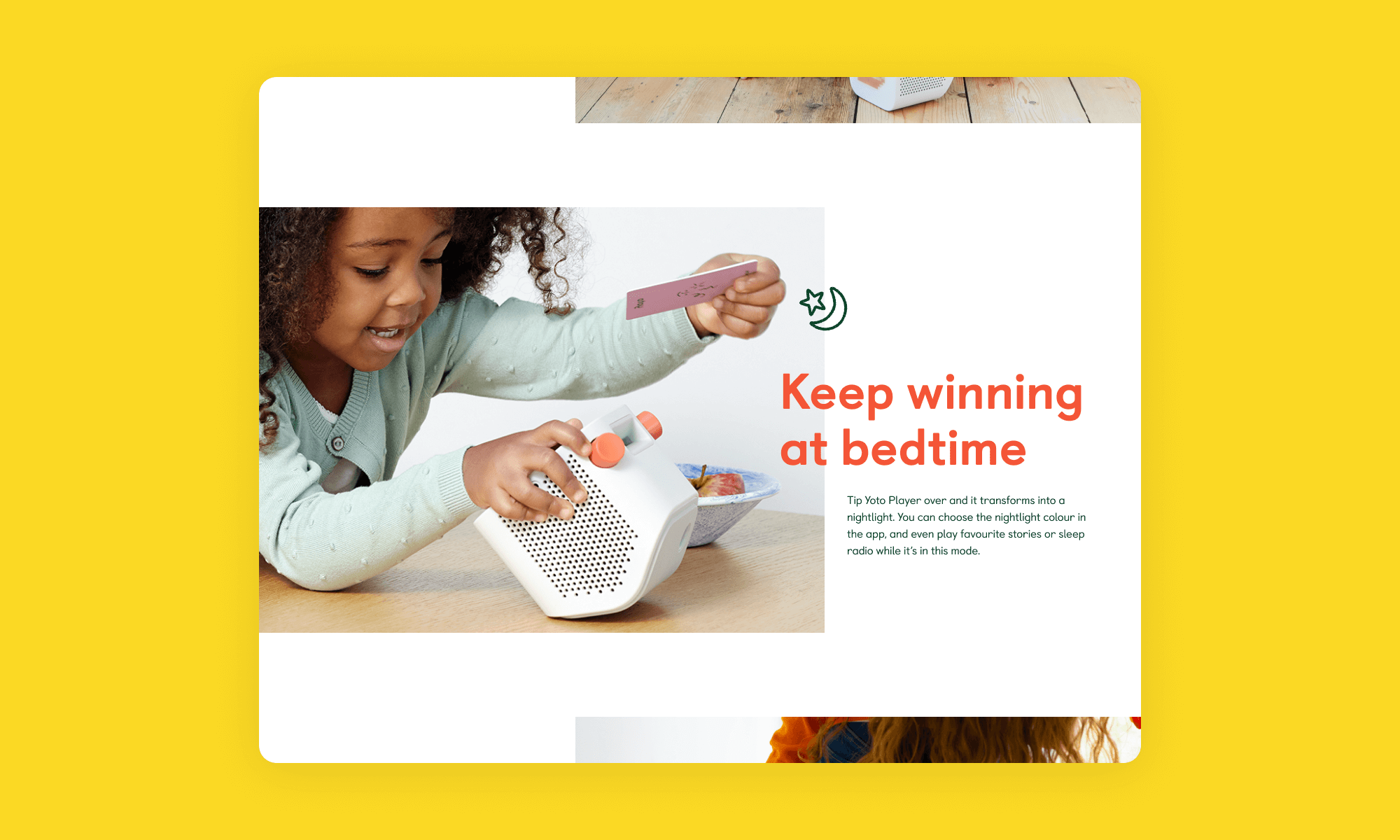
The site works as both a marketing and an e-commerce platform, to inform and inspire as well as help sell more Yoto players, audio cards and a myriad of accessories. I wanted to introduce a goodly amount of brightness and colour into a site that had previously been quite dark and beige. It needed to look fun and inviting to help sell our brand as well as our products.
As Yoto has expanded, another designer has joined the web team and taken on leading the website work, evolving it on from where I originally started, while I shifted my focus to the app.
Ladder image components
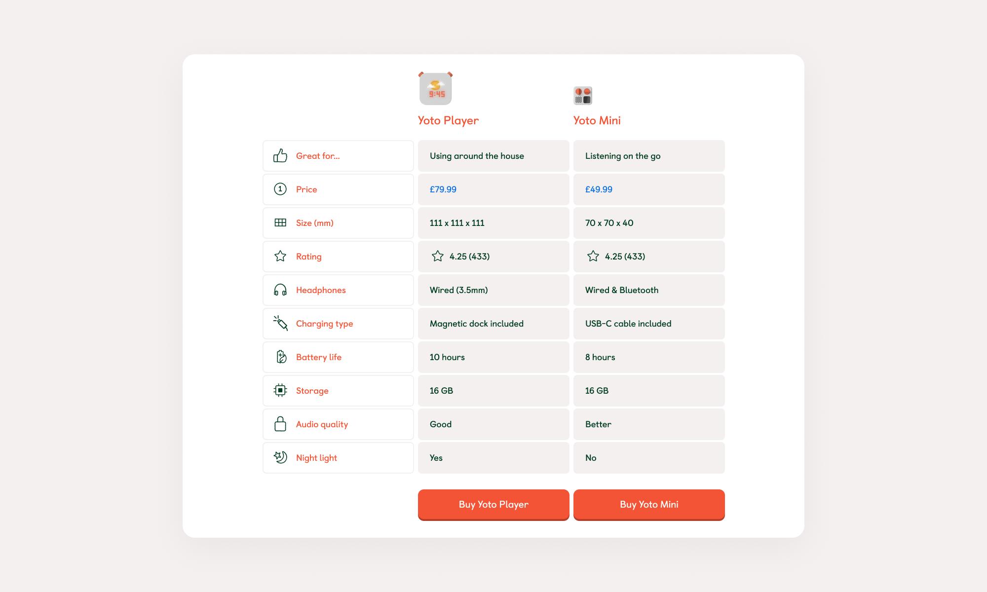
Comparison tables
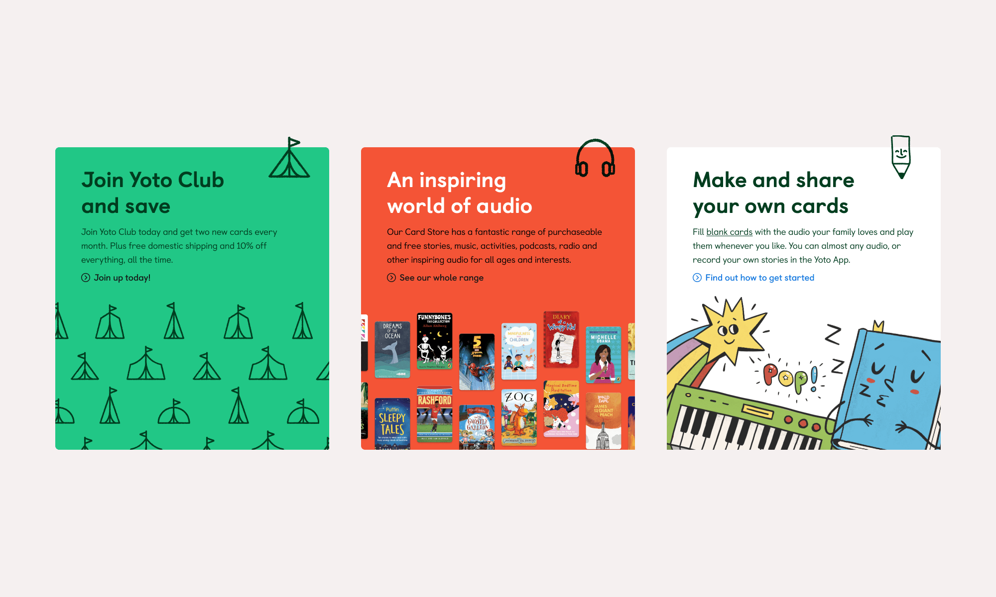
Promotional panels
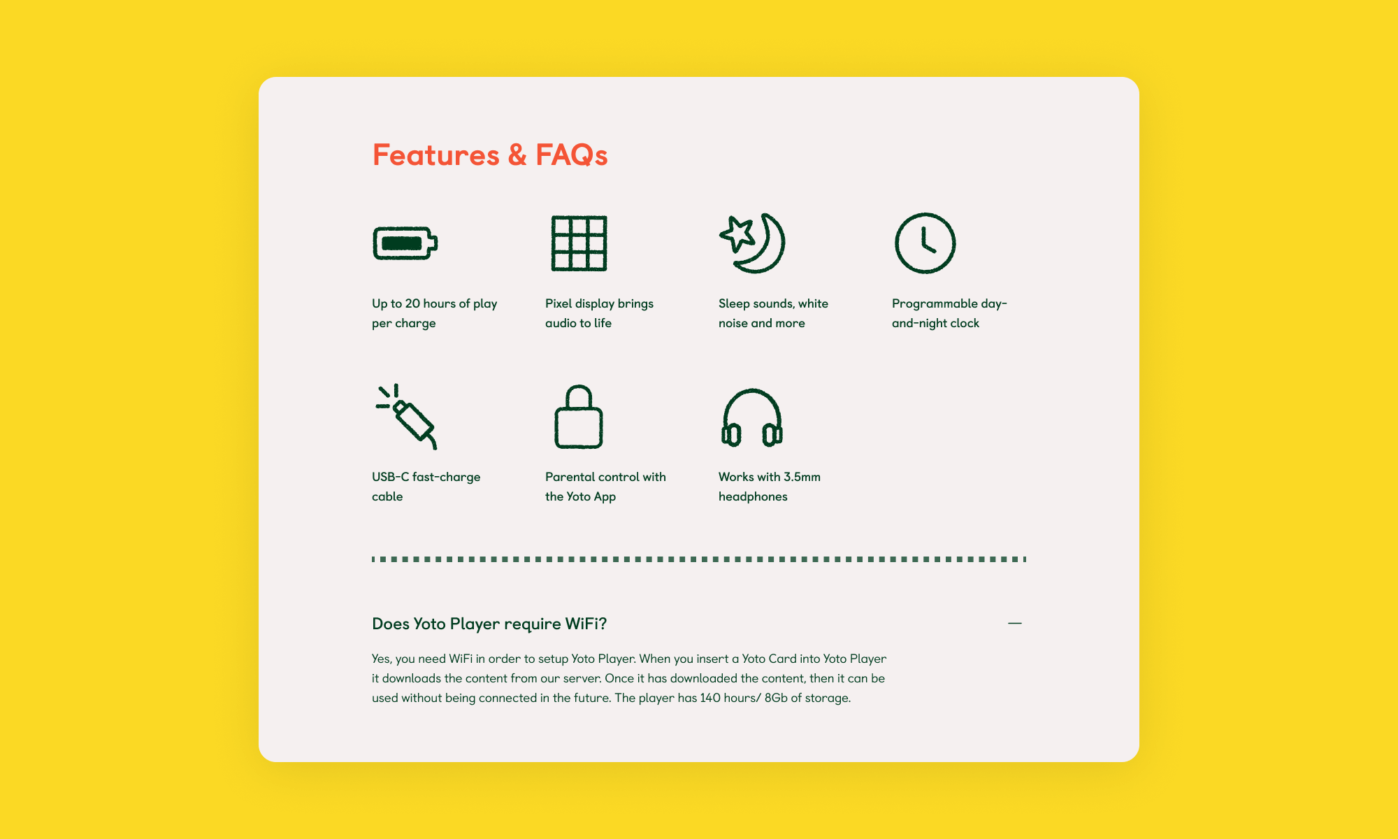
Feature details
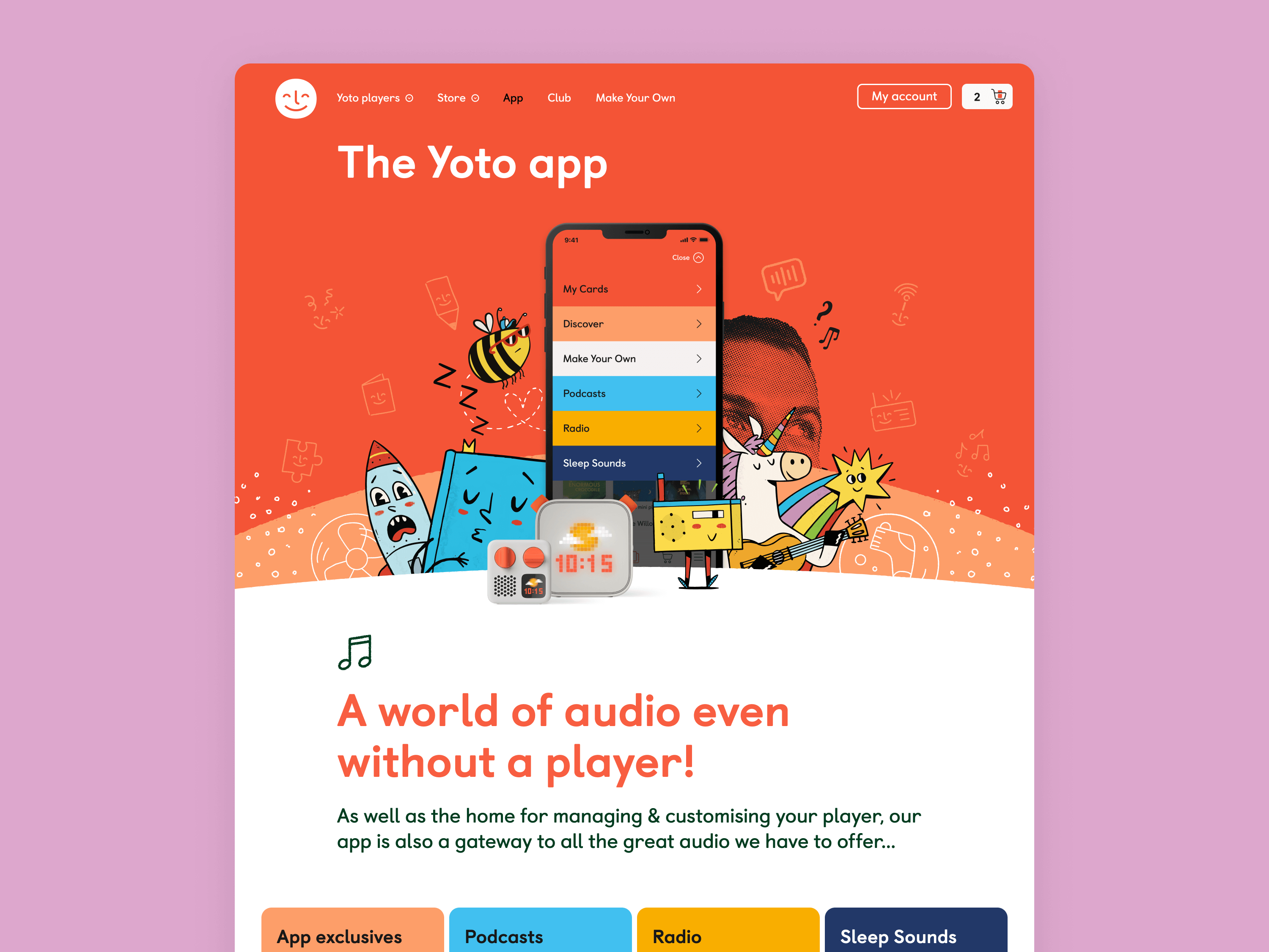
THE APP
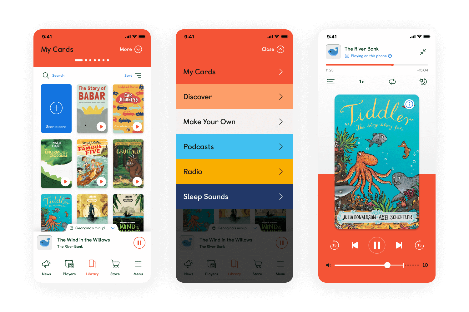
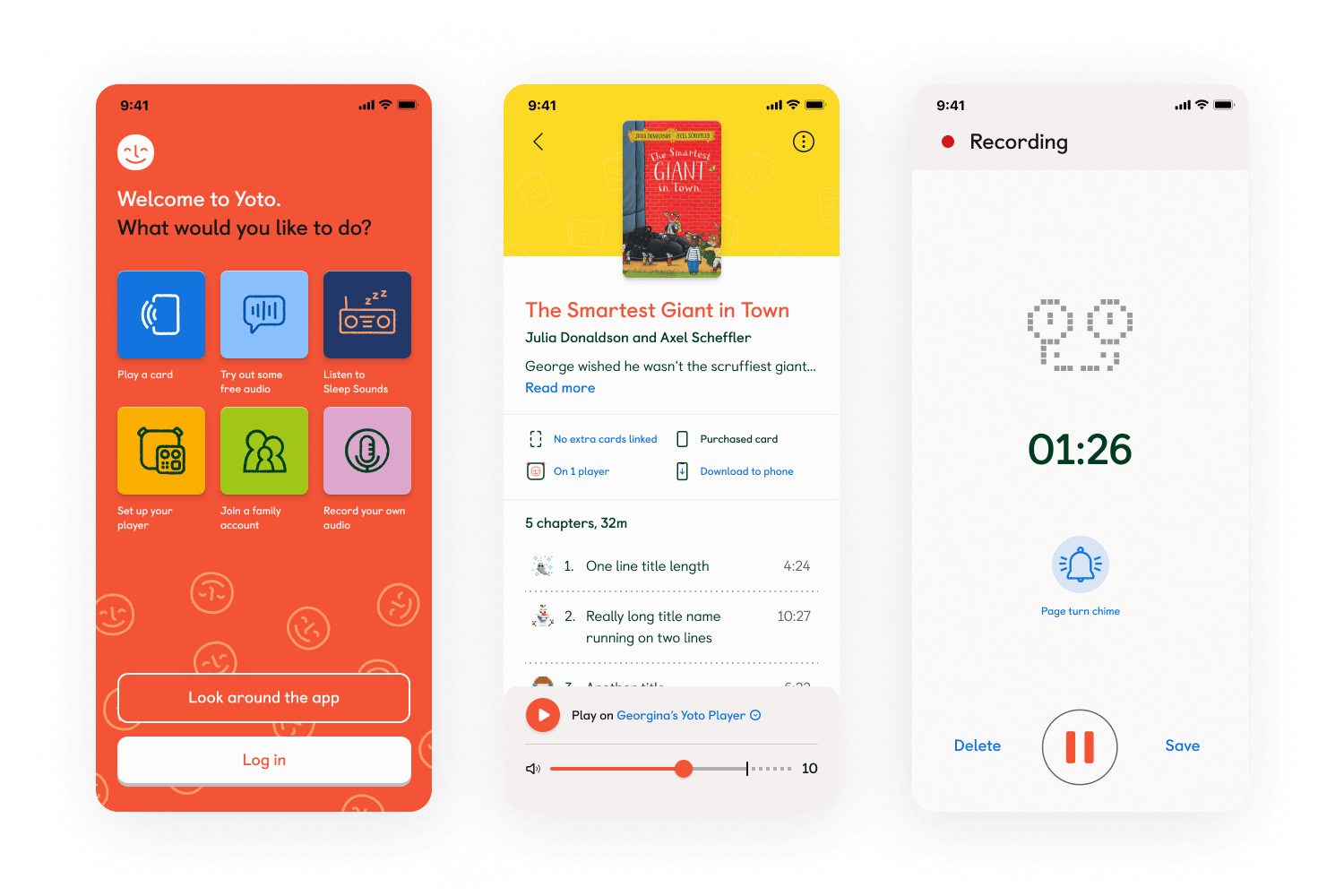
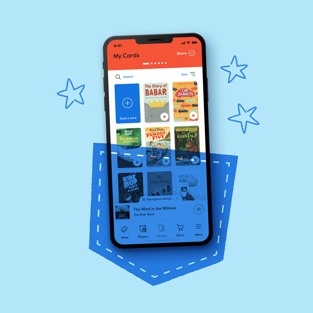
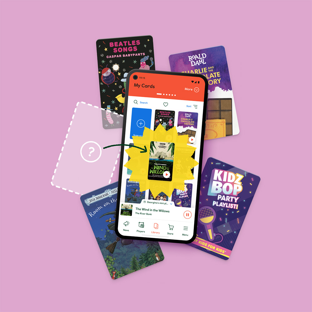
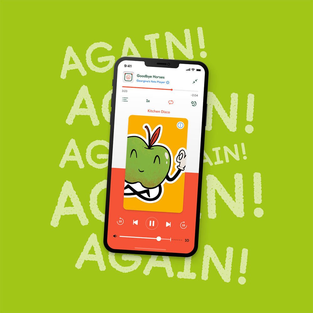
The app is the primary way parents control their child's Yoto player behind the scenes (both on iOS and Android). It's where you manage your card collection, control your player's settings, listen to a myriad of free audio and discover new audio to buy. It's the digital hub of Yoto's ecosystem.
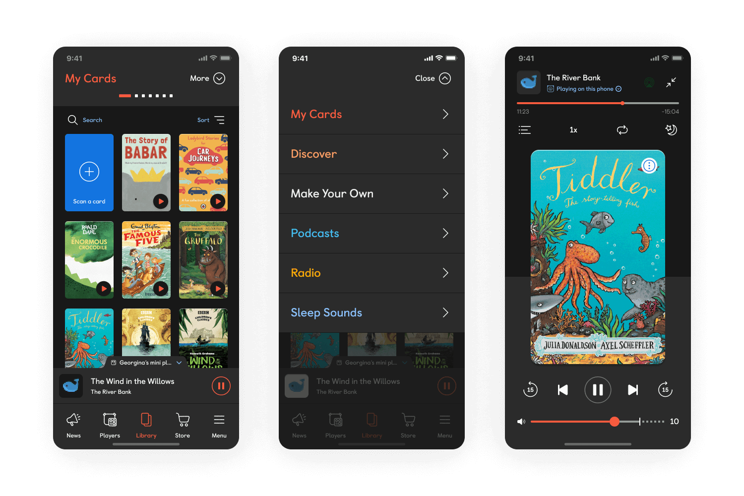
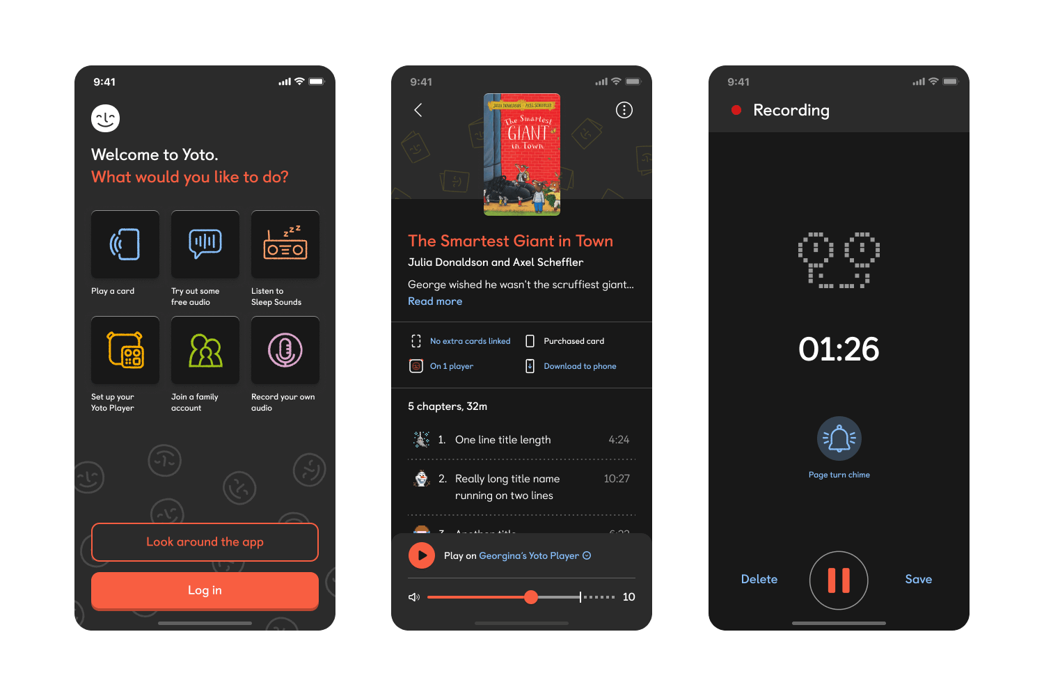
When I joined it was in a similar situation to the website. It was looking very tired and very beige, so we looked to introduce a shot of colour into the interface to make it feel more friendly, and enjoyable to use. We also used colour to help people orientate themselves around the app, with Yoto's audio category colours signposting what form of content was on offer.
As well as redesigning and iterating on what was already in the app, we've also been working to introduce new features such as sleep timers, alarms, dark mode, play controls and most recently bringing the cumbersome web-only Make Your Own cards process into the app to make it more user friendly.
We've slowly been improving the app by taking advantage of Yoto's extremely engaged user base through customer interviews, user testing and prototyping. I've also maintained a healthy collaborative process with the development team, which has helped ensure everyone is onboard and feeling involved with the new design work.
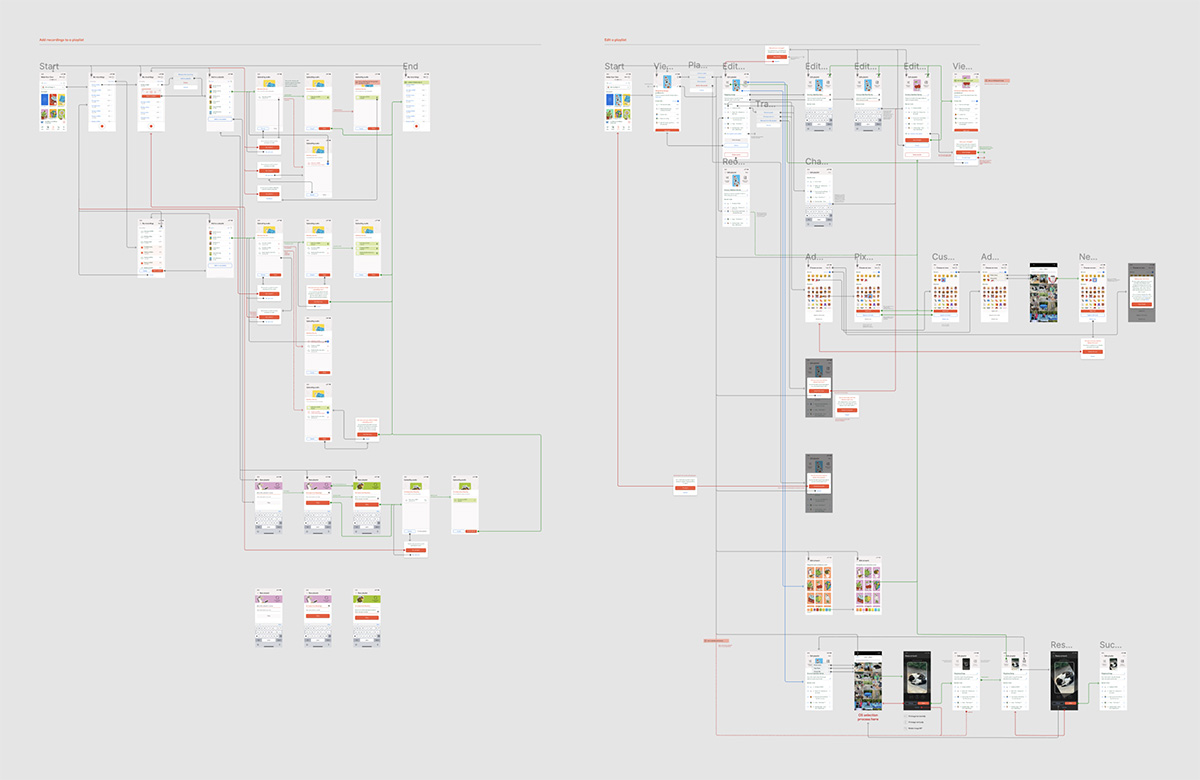
Everyone loves a sexy process flow
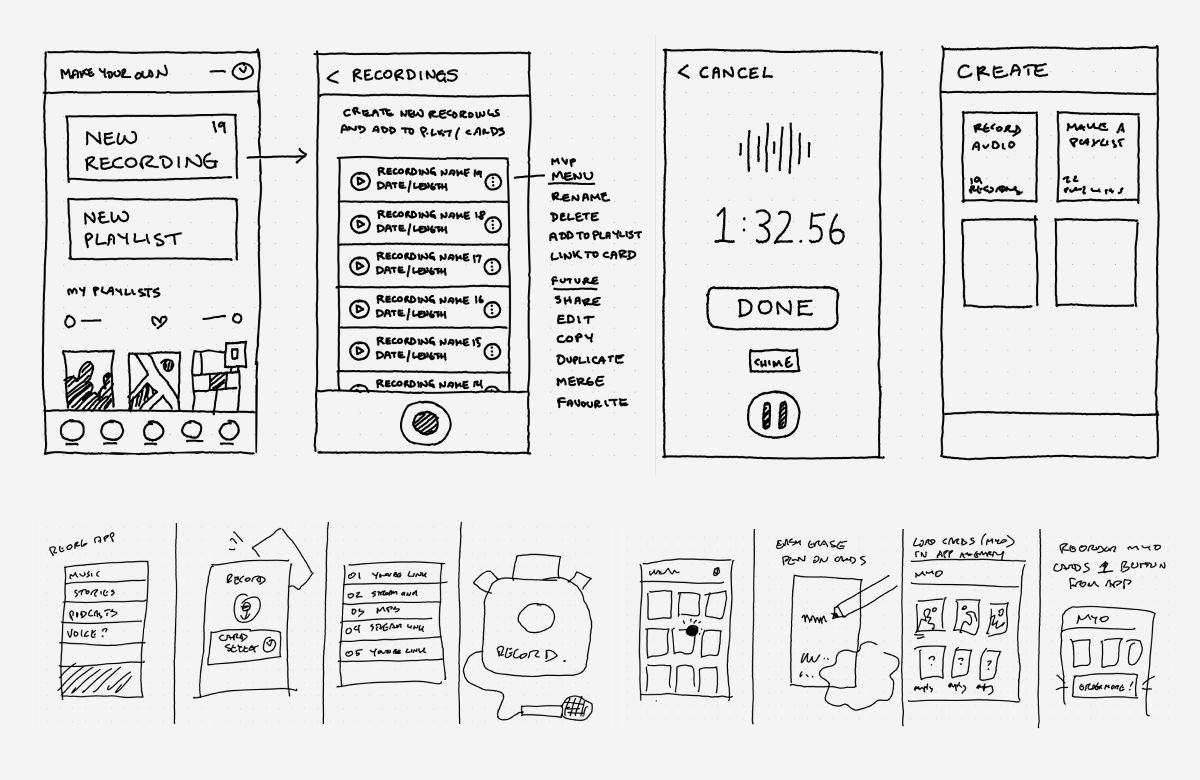
And sketches. Lovely sketches.
DESIGN SYSTEM
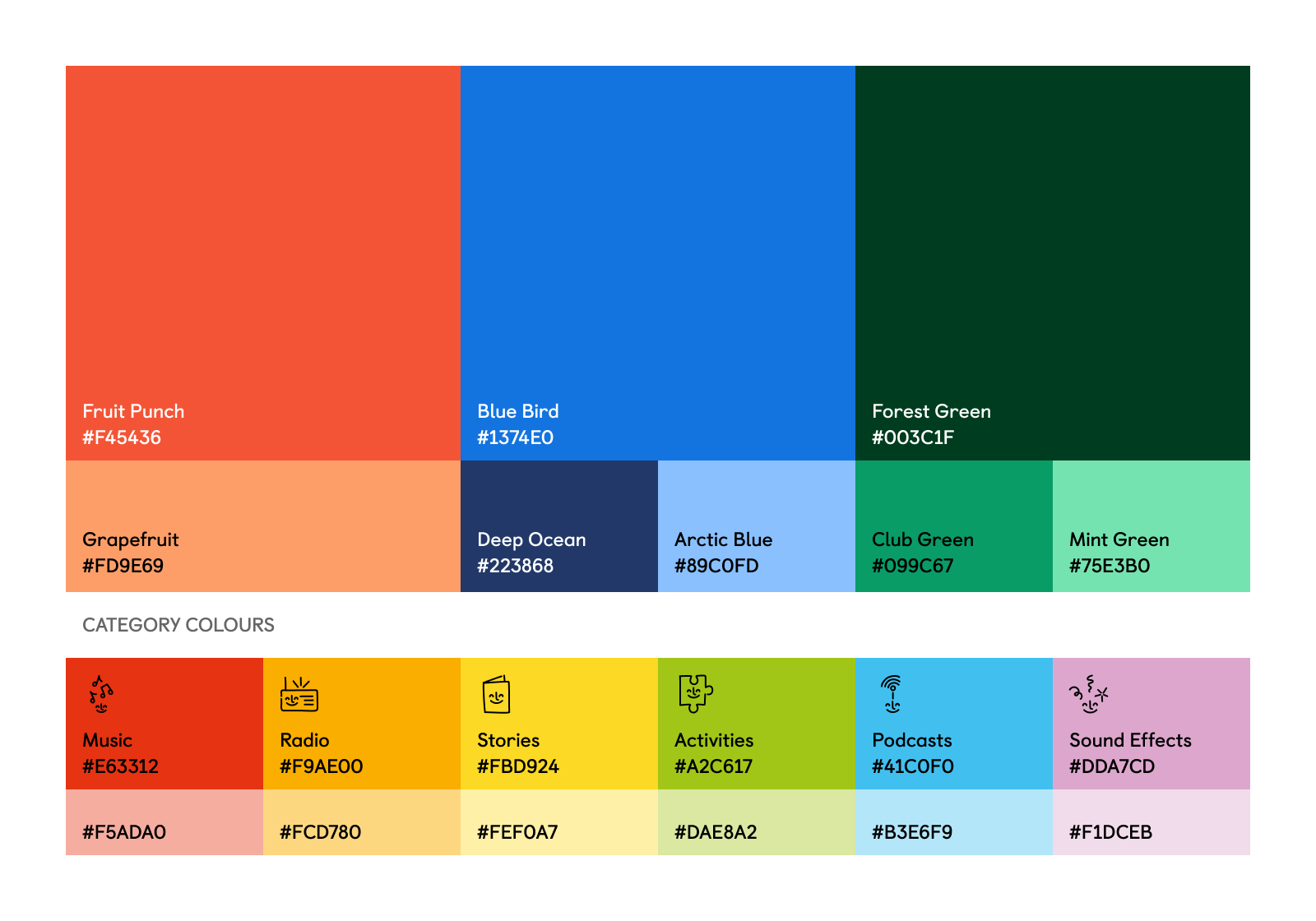
As with all Design Systems, Yoto's is ever evolving. We had to start putting together rules fairly quickly that could be followed by other designers onboarding to the team, as well as those working in the Creative and Marketing teams too.
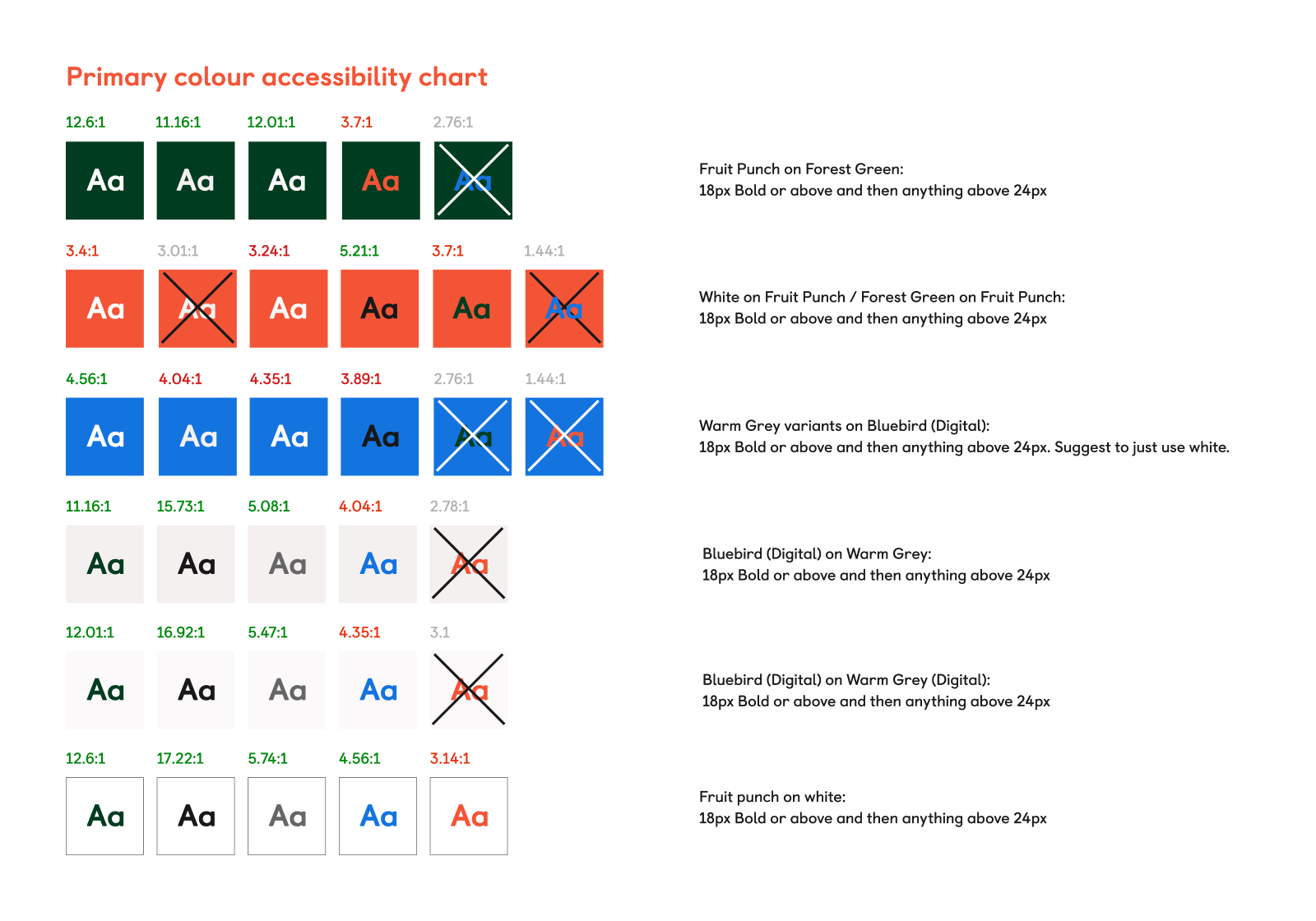
The first job was to rationalise the colour palette supplied to us by Pentagram during a brand refresh that was undertaken when I first joined. Our two main brand colours remained inaccessible according to WCAG guidelines so those had to be altered to make them work better for people with colour blindness and low vision.
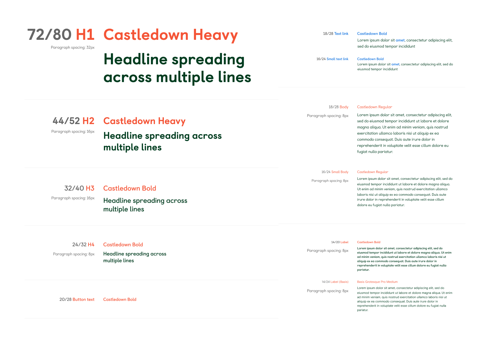
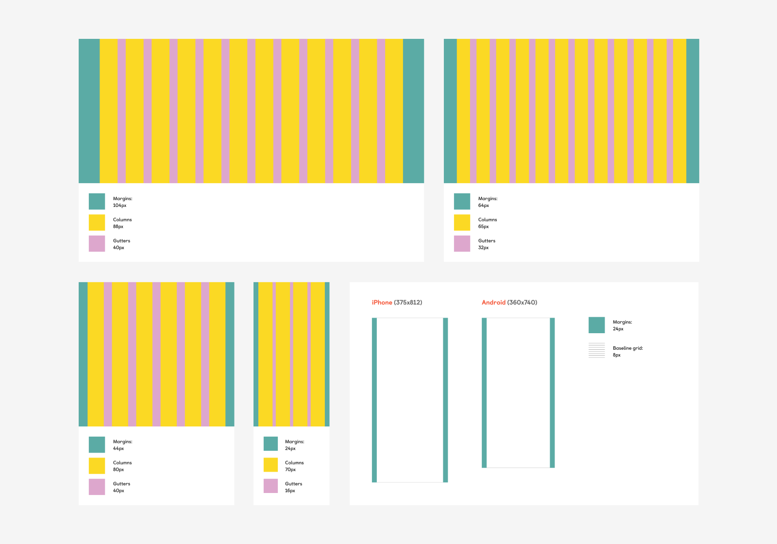
Other elements in the Design System are the usual practicalities. Typography and grid rules that work across both desktop and mobile, buttons states, colour guidelines to help other designers know what works well together as well as remaining accessible, iconography that works at multiple sizes, brand, illustration and photography libraries and Figma autolayout atomic components that can be brought into new designs and altered as required.
All of these are being synced up with the developers' own set of rules established in their online Storybook components to make building new website and app pages faster and easier
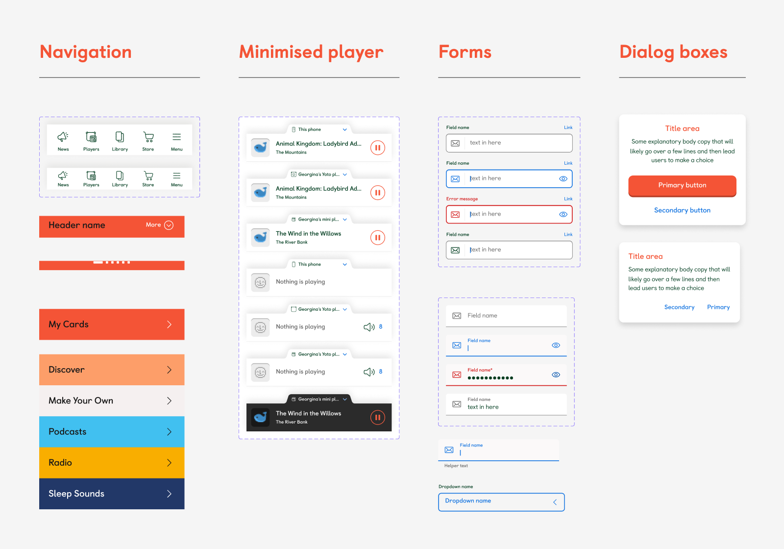
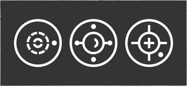
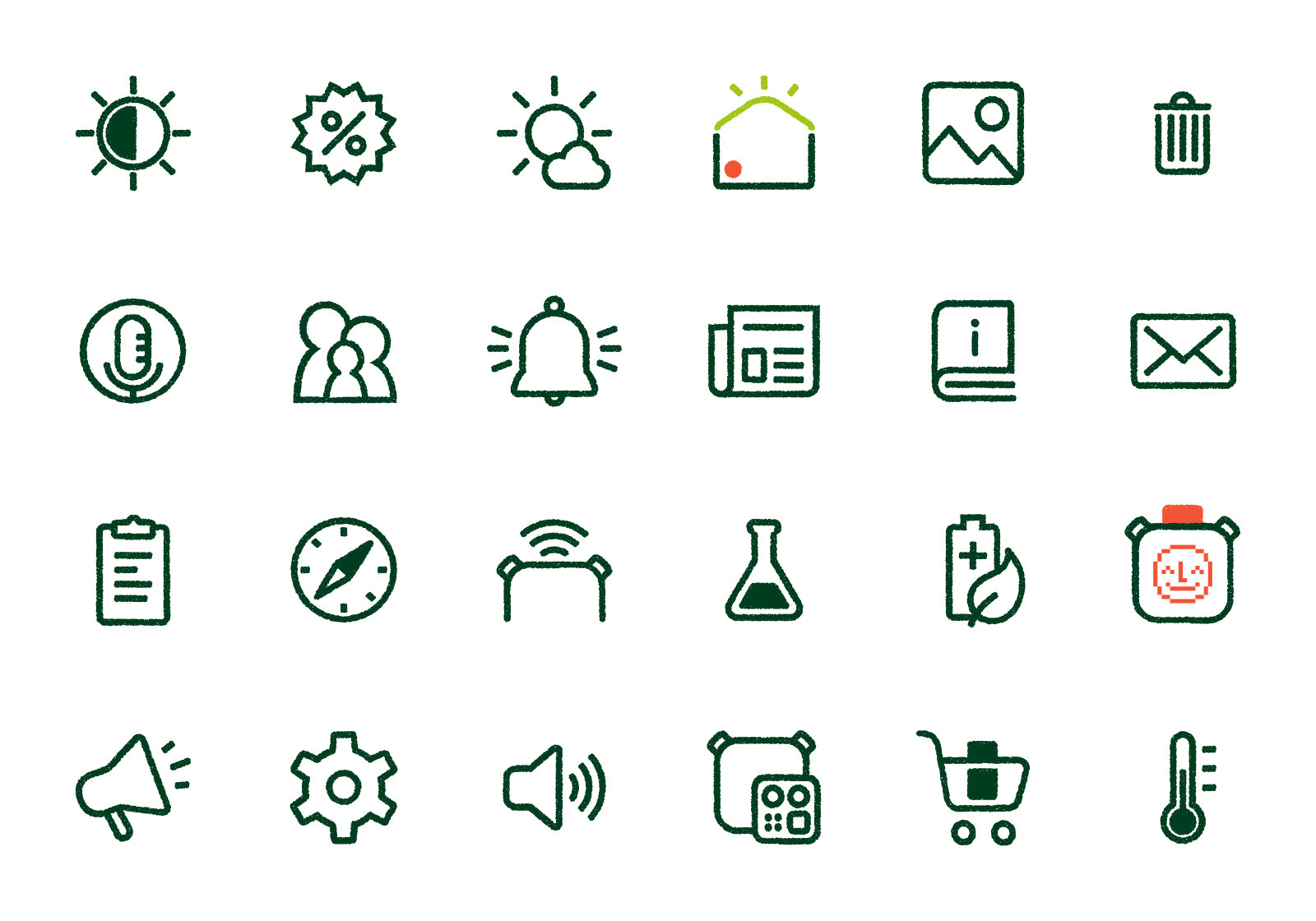
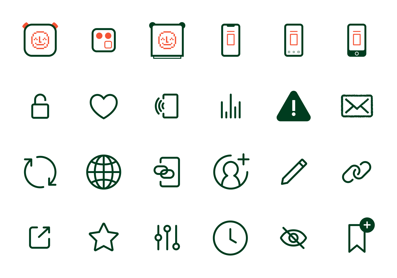
I've also designed and illustrated an extensive collection of icons for the app and the web that both utilise the 'hand drawn' effect developed by Pentagram, but also more functional icons that are designed to resize but retain their line thickness for more flexibility. This is especially useful for device icons that often get used in multiple sizes in the app.
GRAPHICS, PHOTOGRAPHY & ANIMATION
Because the Creative and Marketing teams are so busy, it's often necessary for me to make my own image assets to populate designs in order to get them completed on time for build. I collaborate with the Creative teams to ensure i'm not going off-brand in what I'm doing and often what I make gets integrated into their marketing work too.
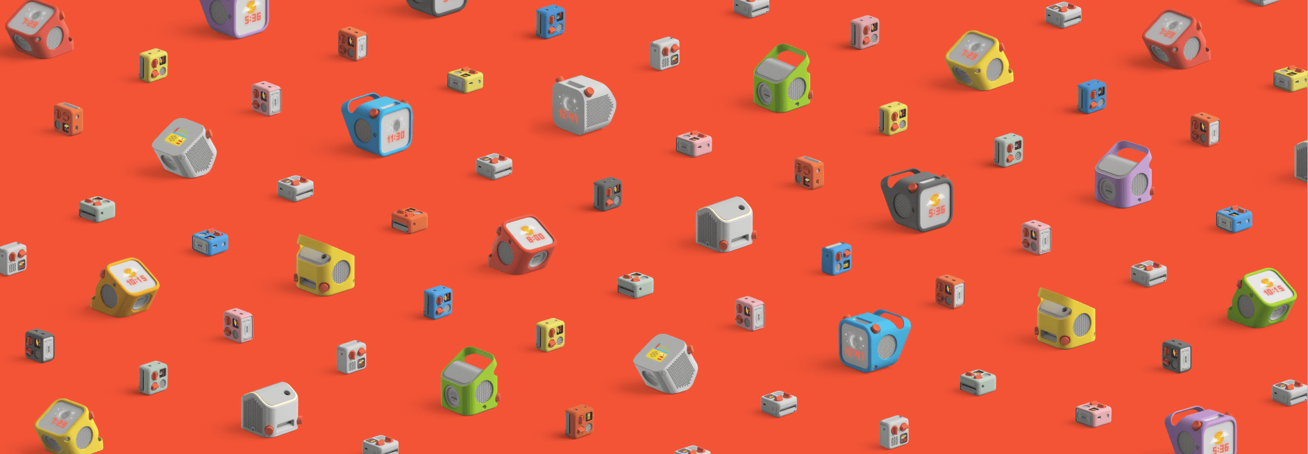
Three sets of 'player landscapes' made from a collection of renders were used across both the site and our social networks too.
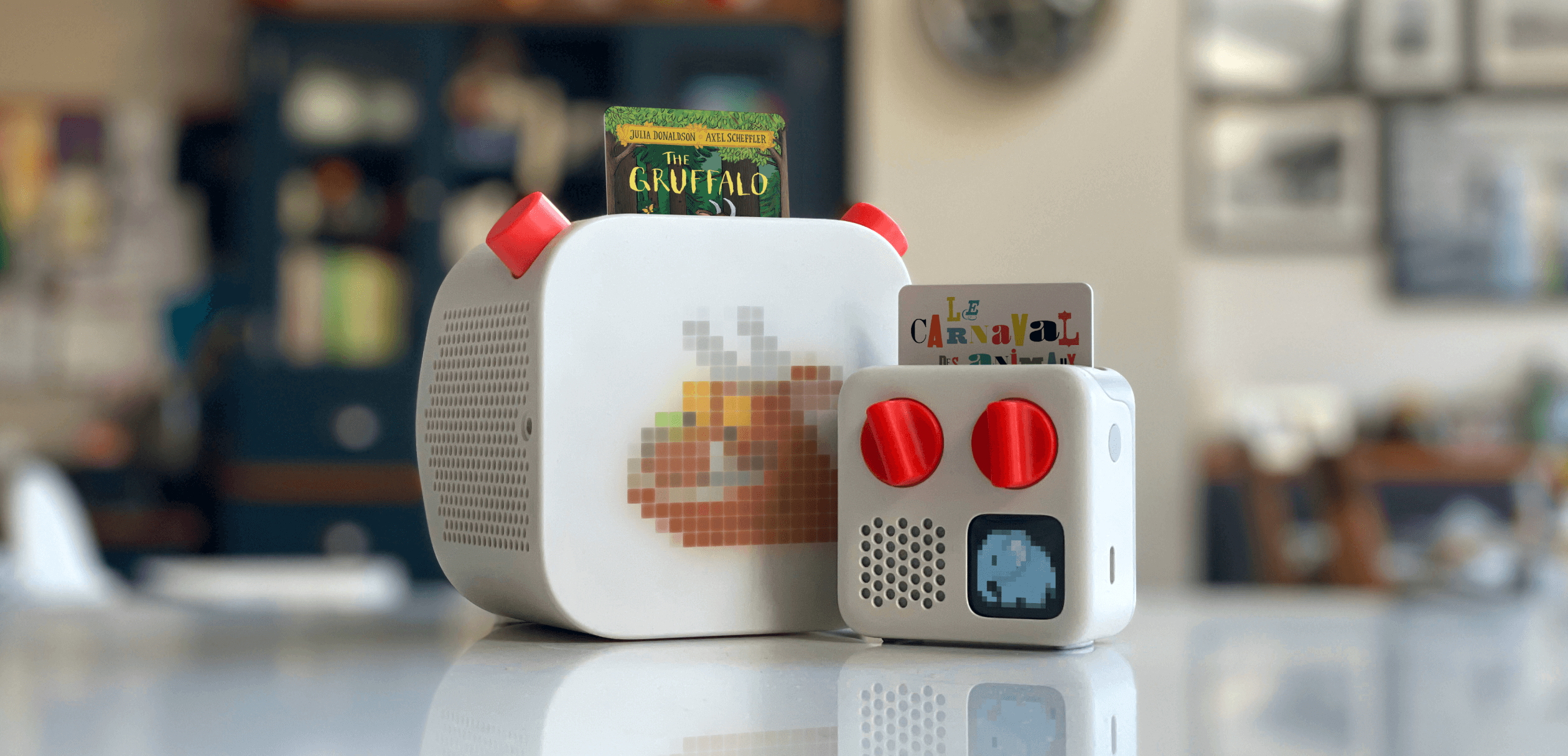
Photographed in my kitchen, and then card and pixel artwork photoshopped in to allow for different audio examples in different territories.
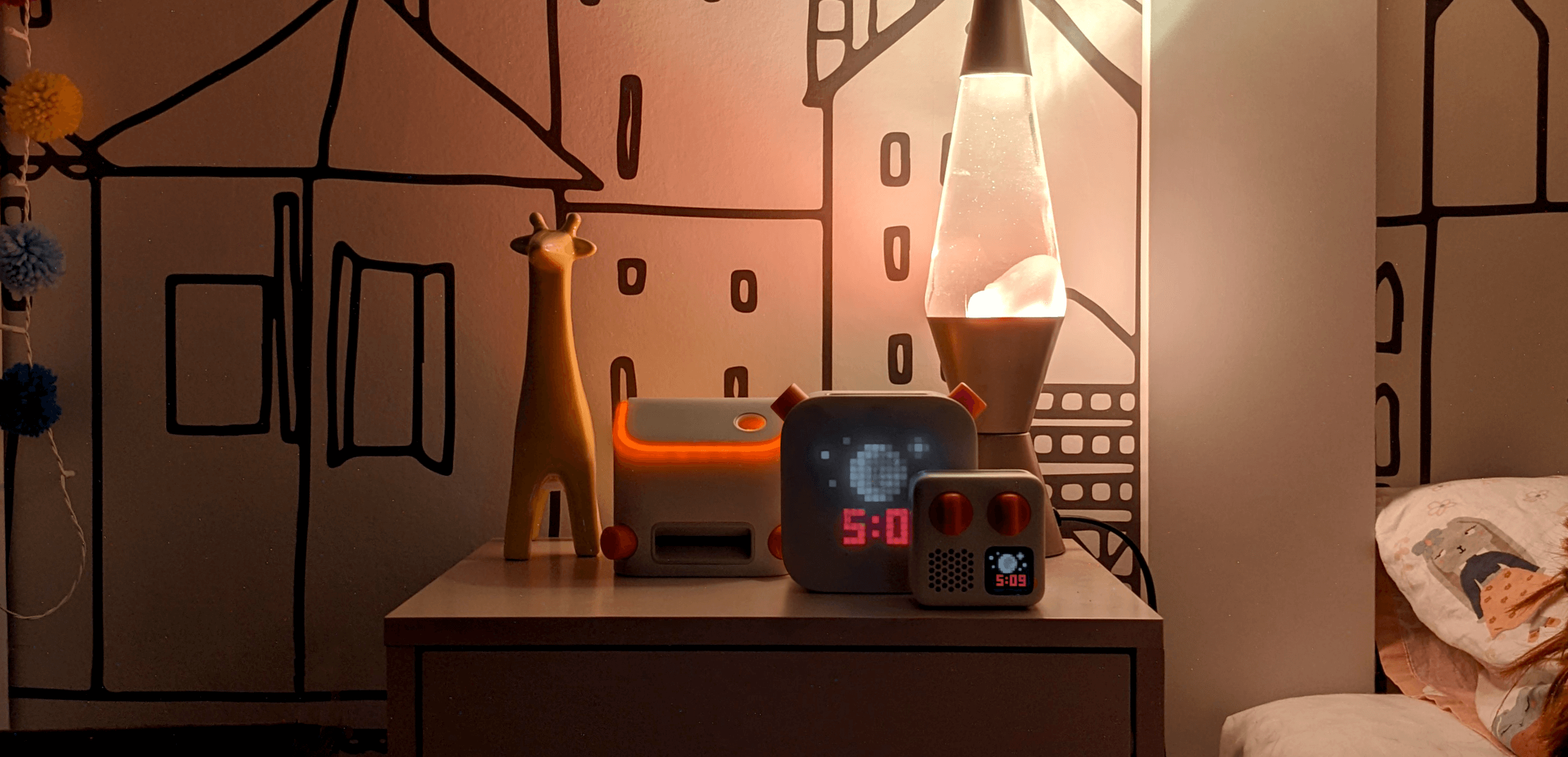
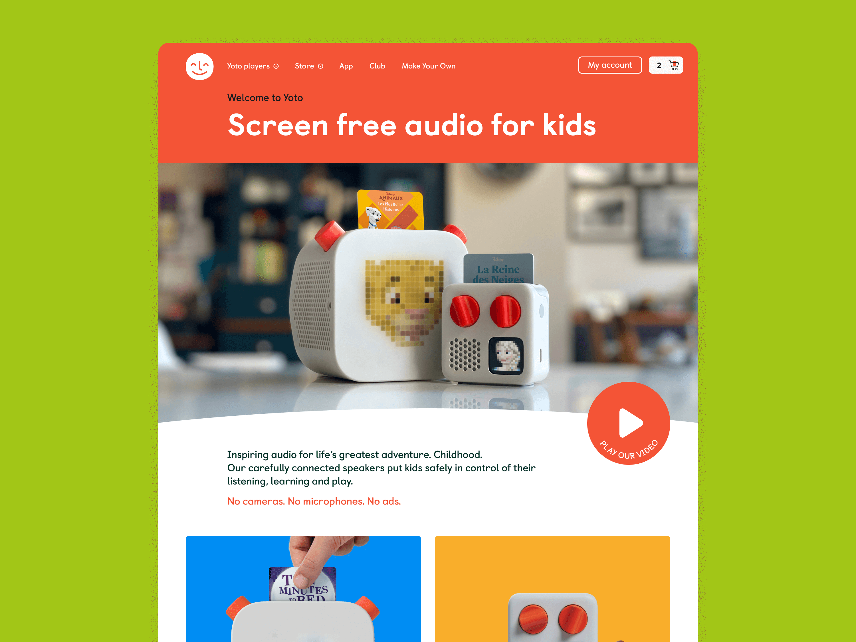
Photographed in my daughter's bedroom. I only own one larger player, so I had to take two photos and comp both together in Photoshop to make it look like 3 players were present.
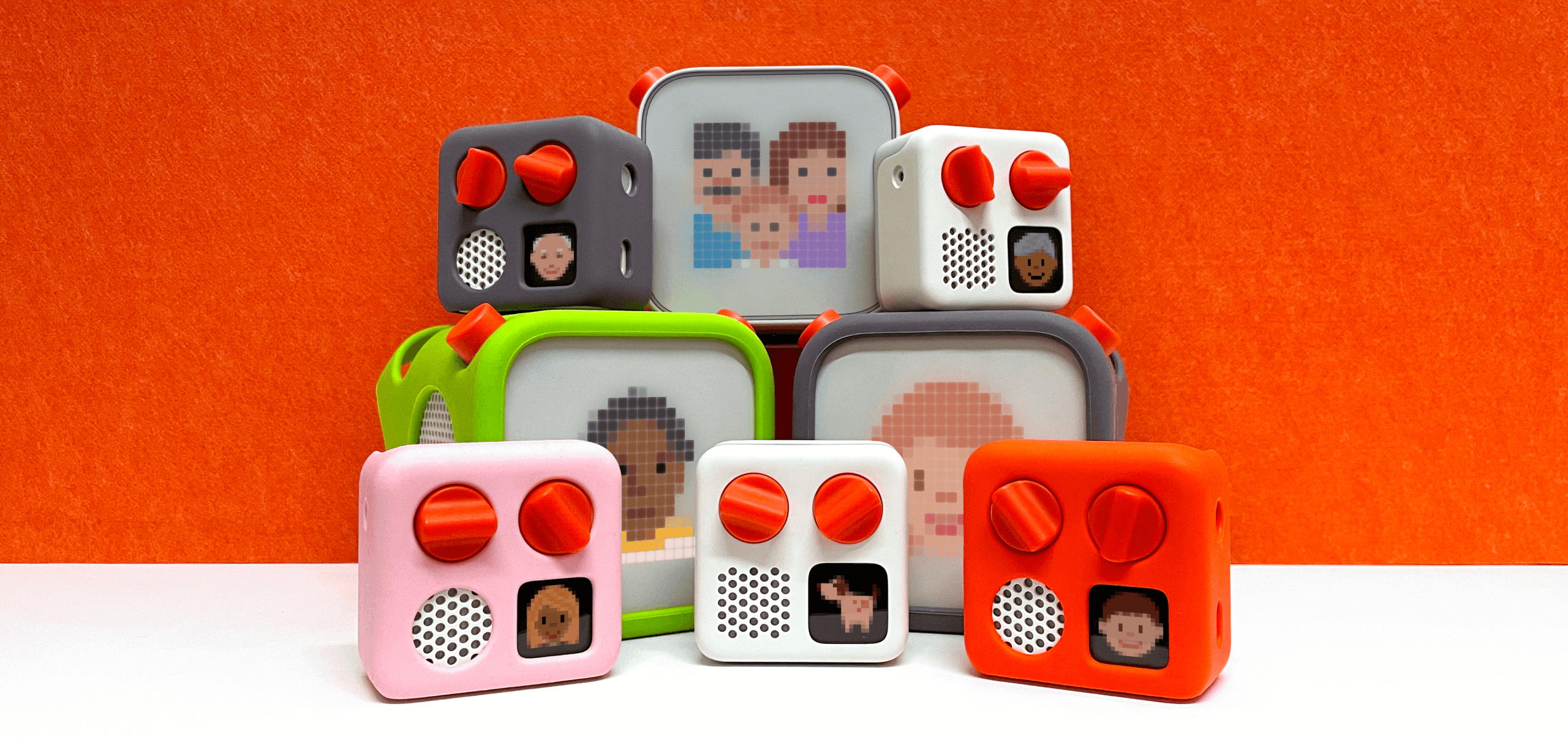
Photographed in Yoto's office, graded and expanded in Photoshop with pixel artwork added in to allow for different artwork in different territories.
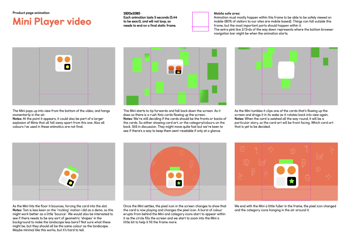
I've worked on various small animated elements for the site and app, but also had the opportunity to create two bespoke animations to display at the top of the product pages when the new headless site launched. I worked with an external agency by storyboarding and creating 3D animatics which they then translated into fully rendered 3D animations.

ARTWORKING AND TEMPLATES
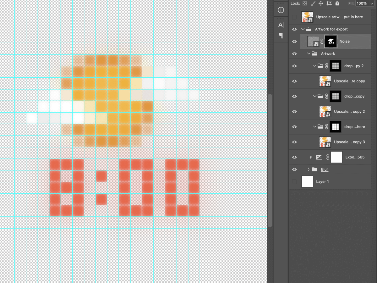
Much of the photography and renders we have made by external agencies are produced with no card art and pixel artwork embedded into the image. That's so we can swap out audio types for different territories, but does mean that artwork has to be carefully photoshopped in to make them look as natural as possible.
I've spent a goodly amount of time photoshopping images to make them easy to update with smart objects for the Creative and Marketing teams, often providing accompanying documentation too. I also worked out how to replicate the glowing pixel art that appears on the front of the player so those can easily be replaced too.